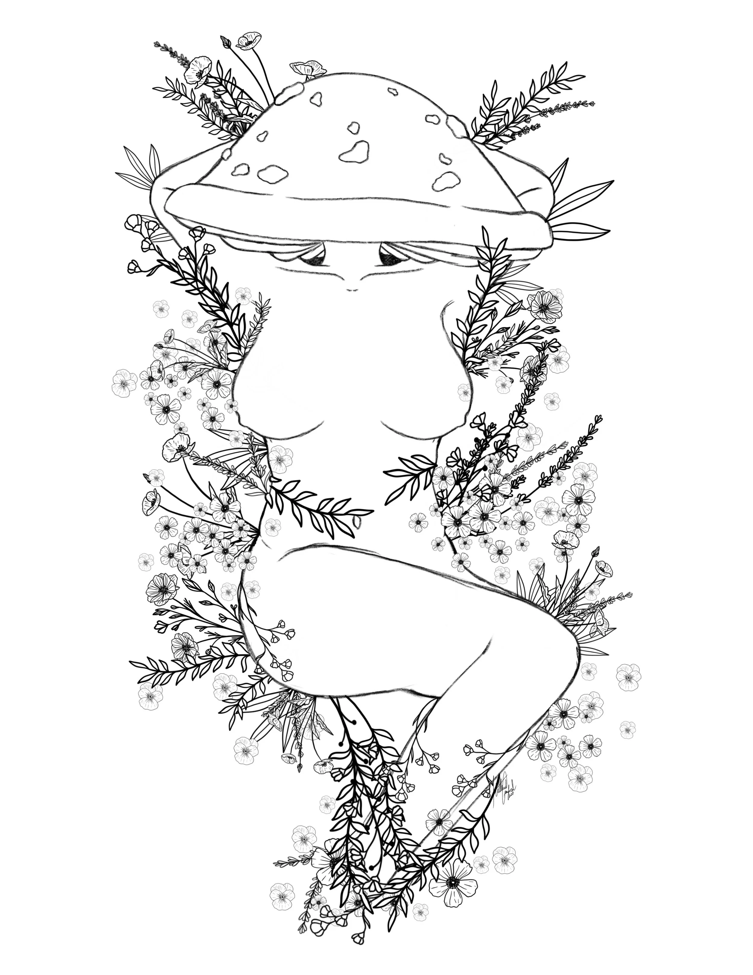
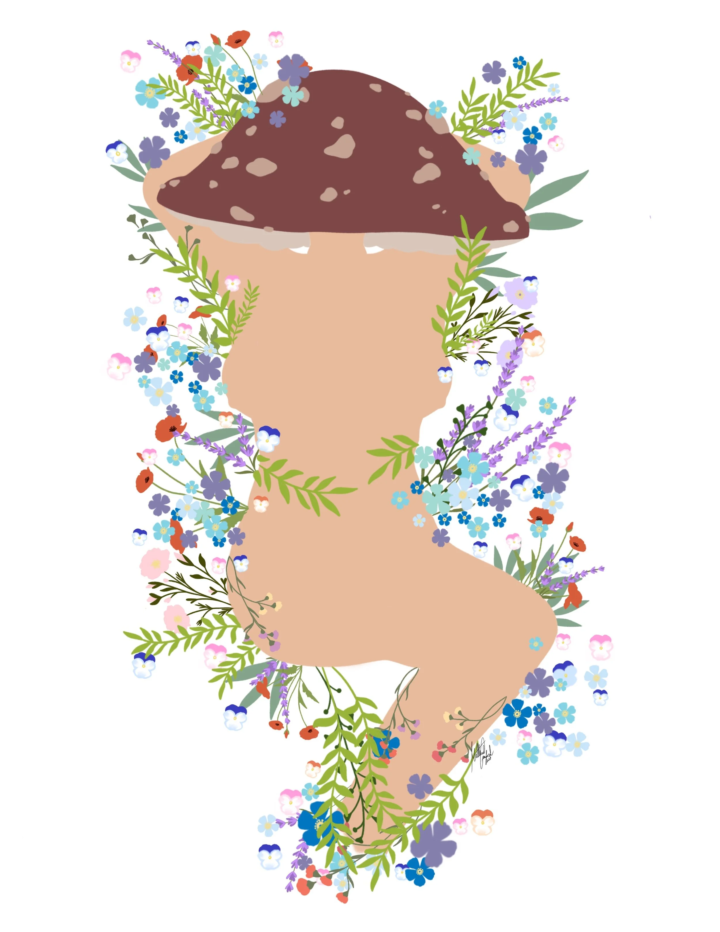
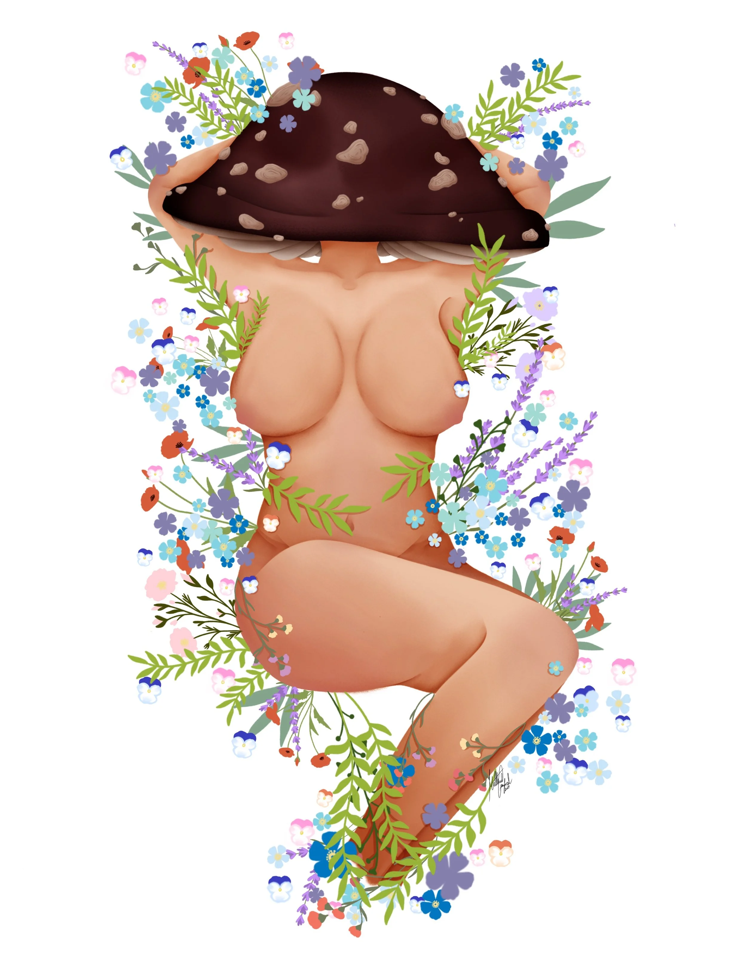
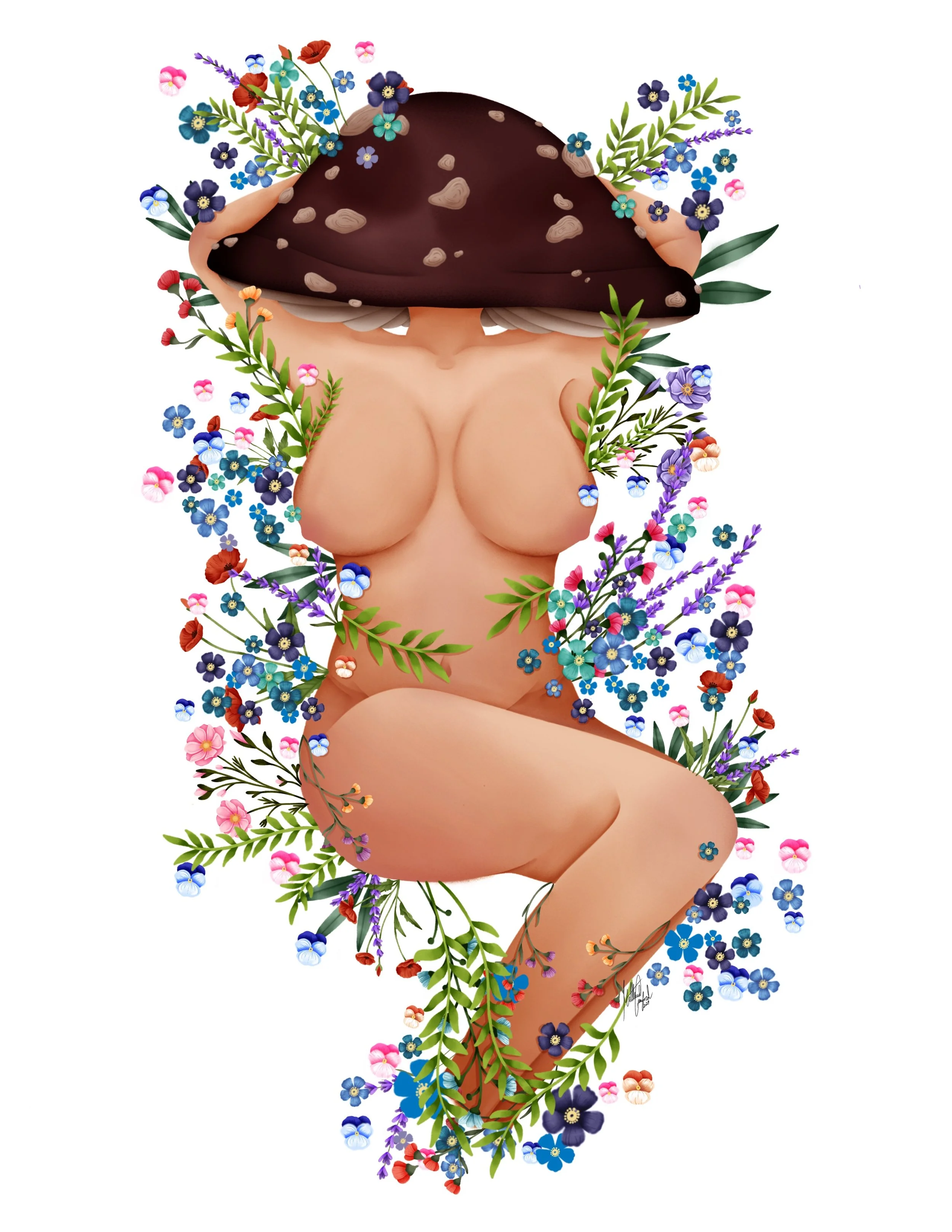
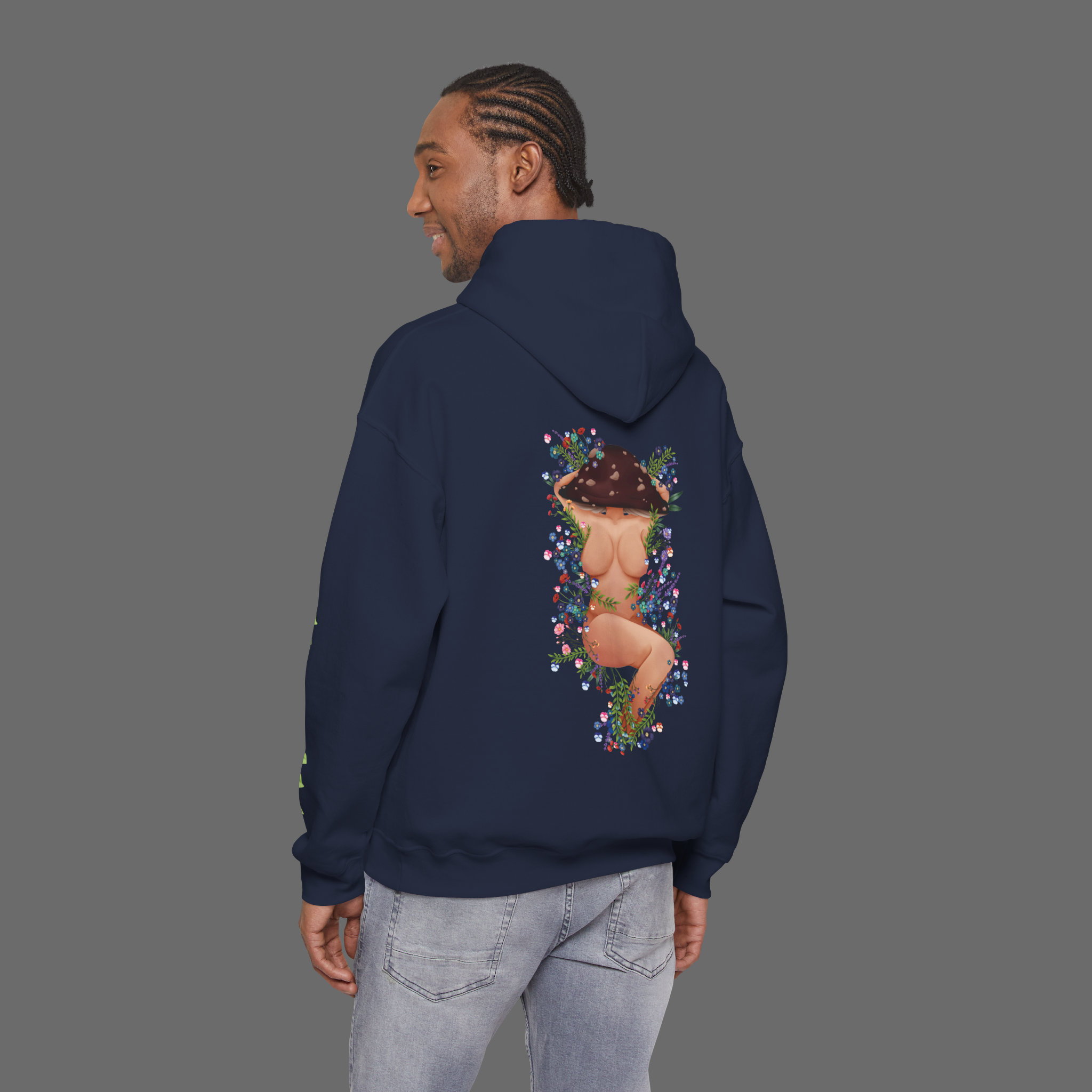
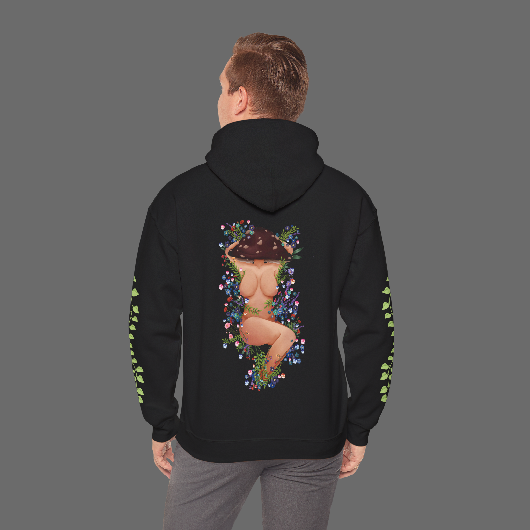
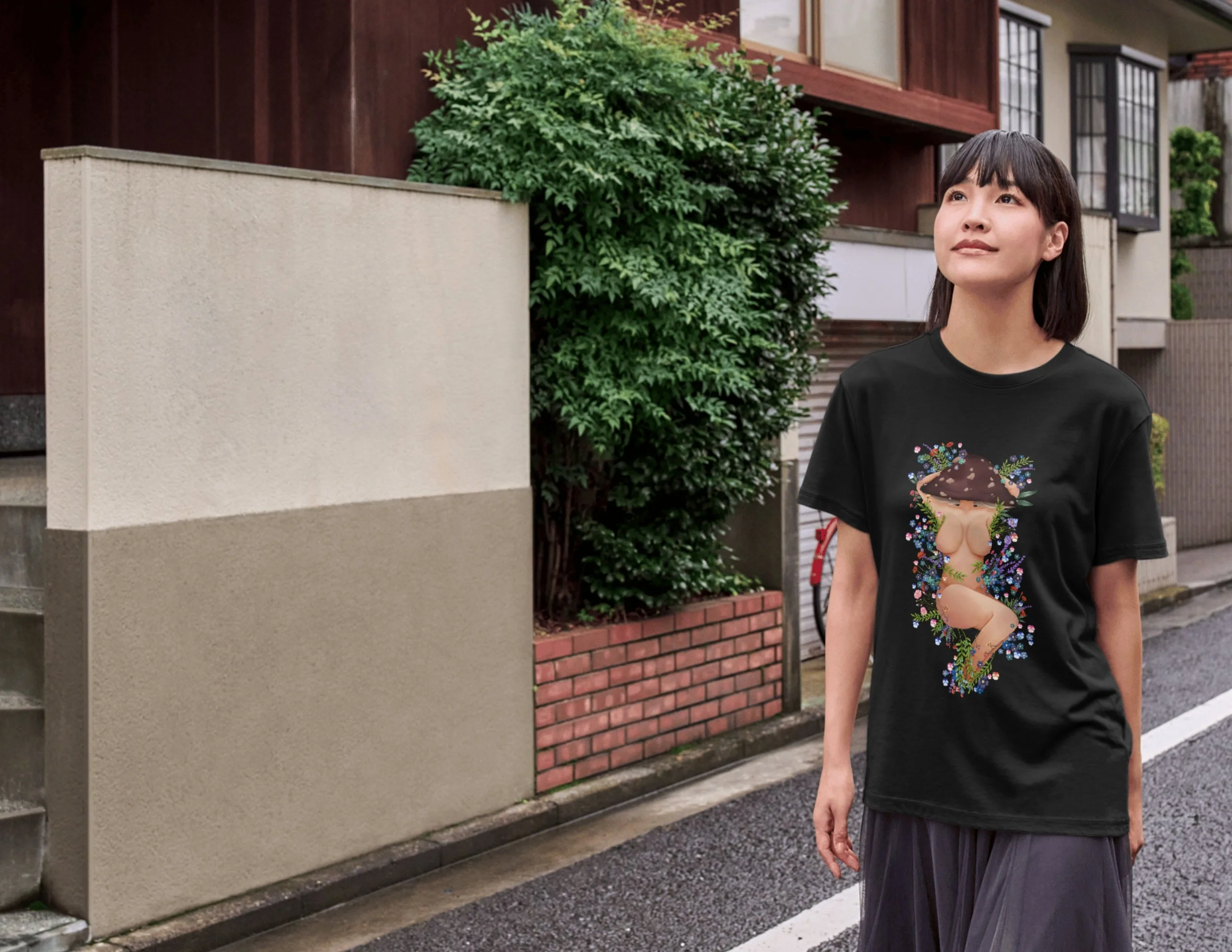
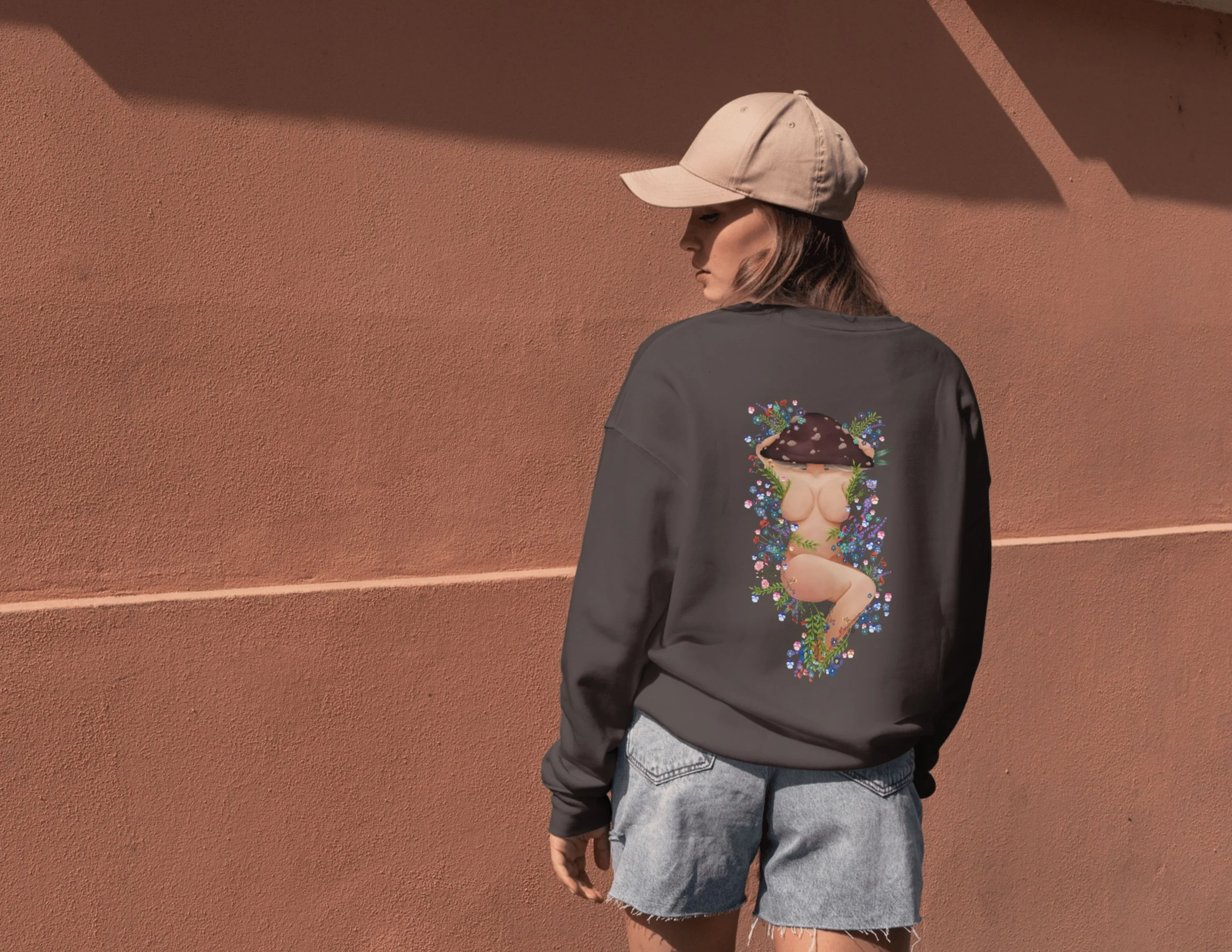
Rooted In Bloom
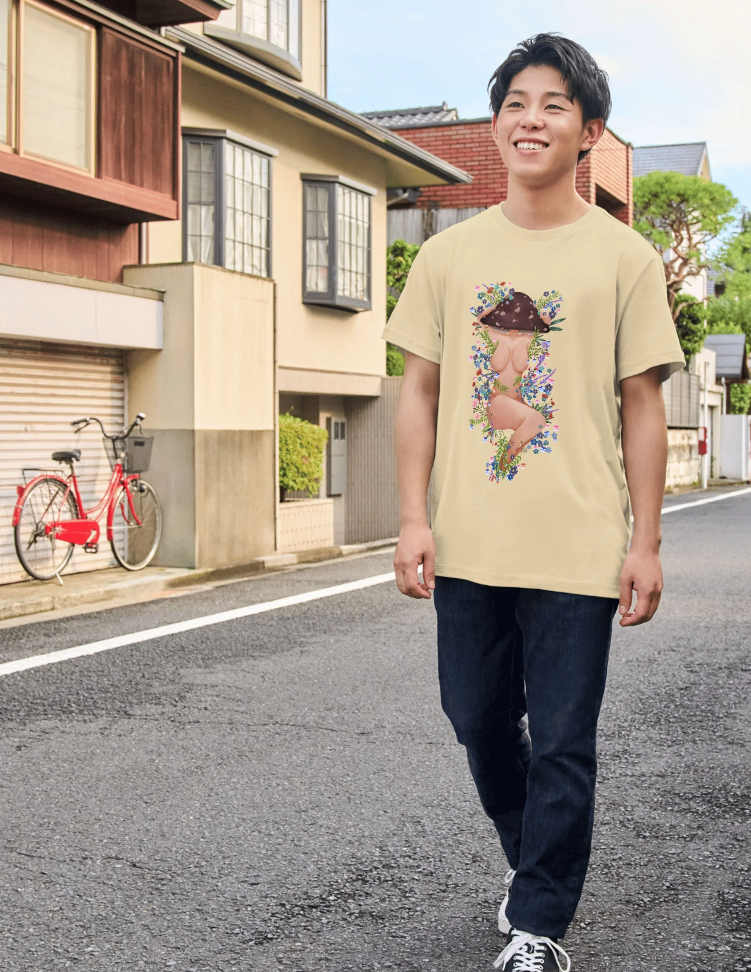
This illustration explores the intersection of nature, femininity, and fantasy through a stylized, body-positive figure integrated seamlessly with organic elements. The central form is intentionally simplified and rounded, allowing the surrounding florals, foliage, and mushroom motif to act as both adornment and narrative framing. By obscuring the figure’s face with a mushroom cap, the design shifts focus away from identity and toward form, symbolism, and atmosphere, inviting interpretation rather than defining a specific character.
A muted yet rich colour palette was chosen to evoke an earthy, woodland tone while maintaining visual contrast against darker backgrounds, particularly when applied to apparel. Floral elements were carefully arranged to guide the viewer’s eye vertically through the composition, creating balance and flow while reinforcing the natural growth motif. The vines placed along the sleeves extend the illustration beyond the central graphic, enhancing garment interaction and emphasizing cohesion between the artwork and the product.
From a technical perspective, the piece demonstrates controlled digital rendering, clean layering, and attention to print-ready detailing. Soft shading and smooth gradients were used to maintain depth without overpowering the stylized aesthetic. The design was created with versatility in mind, functioning both as a standalone illustration and as a wearable graphic suitable for merchandise applications.
Overall, this project reflects an intentional blend of illustrative storytelling, thoughtful composition, and practical design considerations, aligning expressive artwork with real-world product design.
Progress
Mock-ups
Materials used:
Procreate
Learning Objectives & Skills Demonstrated:
☾ Conceptual Illustration & Visual Storytelling
☼ This project strengthened the ability to communicate themes of nature, fantasy, and body positivity through symbolic imagery, using composition and visual metaphor rather than explicit narrative.
☾ Stylized Figure Design & Form Simplification
☼ The human figure was intentionally simplified and rounded to maintain a soft, approachable aesthetic while preserving anatomical clarity and expressive posture.
☾ Organic Composition & Flow
☼ Floral arrangements, vines, and natural elements were strategically placed to guide the viewer’s eye vertically through the composition, creating rhythm, balance, and a sense of organic movement.
☾ Digital Illustration Workflow & Layer Management
☼ The piece demonstrates effective use of layered construction, refined, clean lines, and controlled colour application, maintaining flexibility for both illustration and merchandise production.
☾ Colour Theory & Mood Development
☼ Earthy tones and contrasting floral colours were used to evoke a woodland fantasy atmosphere while ensuring sufficient contrast for visibility on dark apparel backgrounds.
☾ Design for Apparel & Product Application
☼ The illustration was created with print placement in mind, ensuring the central artwork and sleeve elements function cohesively as a wearable design rather than a static image.
Challenges & Solutions
☾ Balancing Expressive Figure Design with Tasteful Stylization
✶ Depicting a stylized human figure in a fantasy context while maintaining visual sensitivity and artistic intent required careful control of form, pose, and framing.
☼ This was resolved by simplifying anatomy into soft, rounded shapes and using foliage, florals, and pose to guide focus. Strategic placement of natural elements ensured the figure remained expressive and symbolic rather than explicit.
☾ Adapting Illustrative Artwork for Merchandise Application
✶ Illustrations created without product context can feel disconnected once placed on apparel.
☼ To prevent this, the artwork was designed with garment placement in mind from the start. The central composition was scaled for the back of the hoodie, while vine motifs were isolated and adapted for sleeve placement, creating a cohesive and intentional wearable design.
☾ Integrating Dense Detail Without Overcrowding the Design
✶ The inclusion of intricate florals and foliage introduced the risk of visual clutter that could distract from the central figure.
☼ The solution was a layered detail hierarchy. Larger botanical forms were established first, followed by medium accents and finally smaller details. Negative space was intentionally preserved to allow the illustration to breathe and maintain clarity.
☾ Ensuring Colour Readability on Dark Apparel
✶ Colours that appear vibrant on a digital canvas can lose contrast or become muted when printed on dark fabrics.
☼ This was solved by testing colour values against dark backgrounds early in the process. Saturation and brightness were selectively increased on focal elements, while outlines and edge contrast were refined to ensure the design remained legible in print.