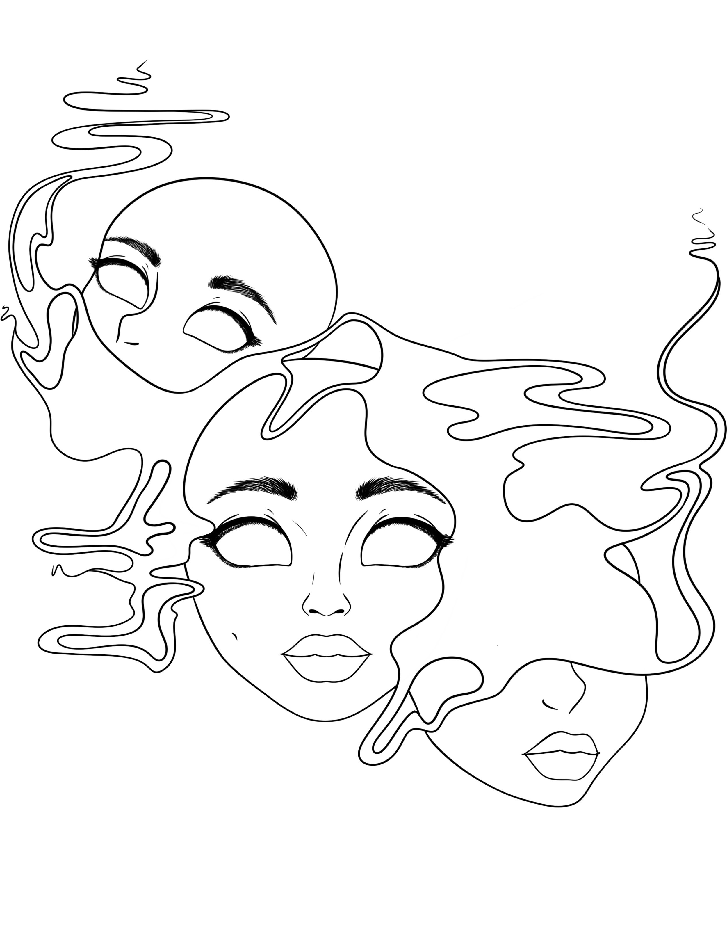
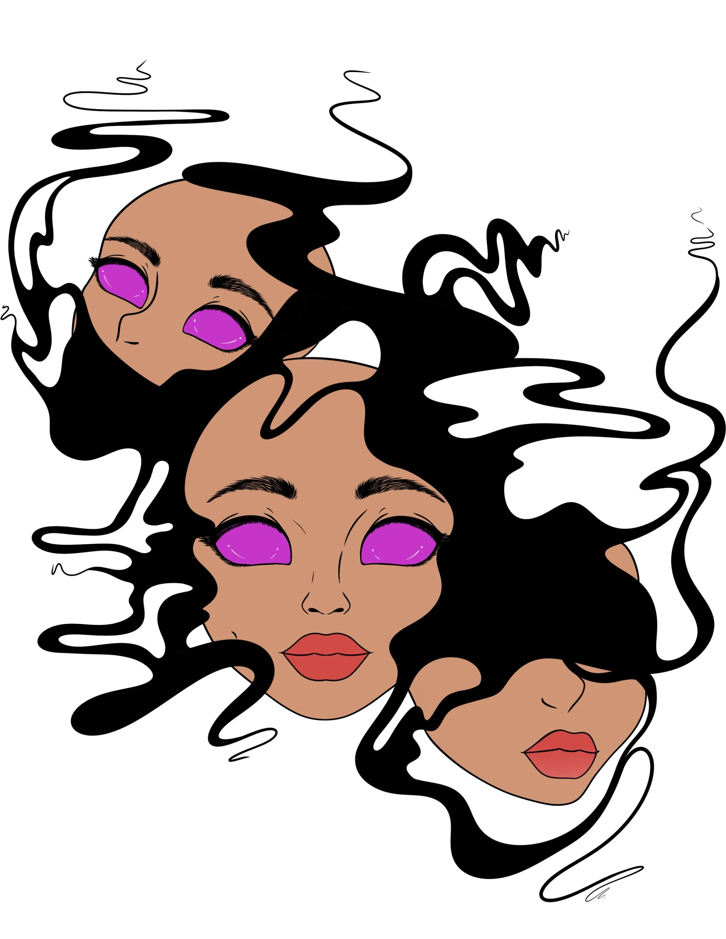
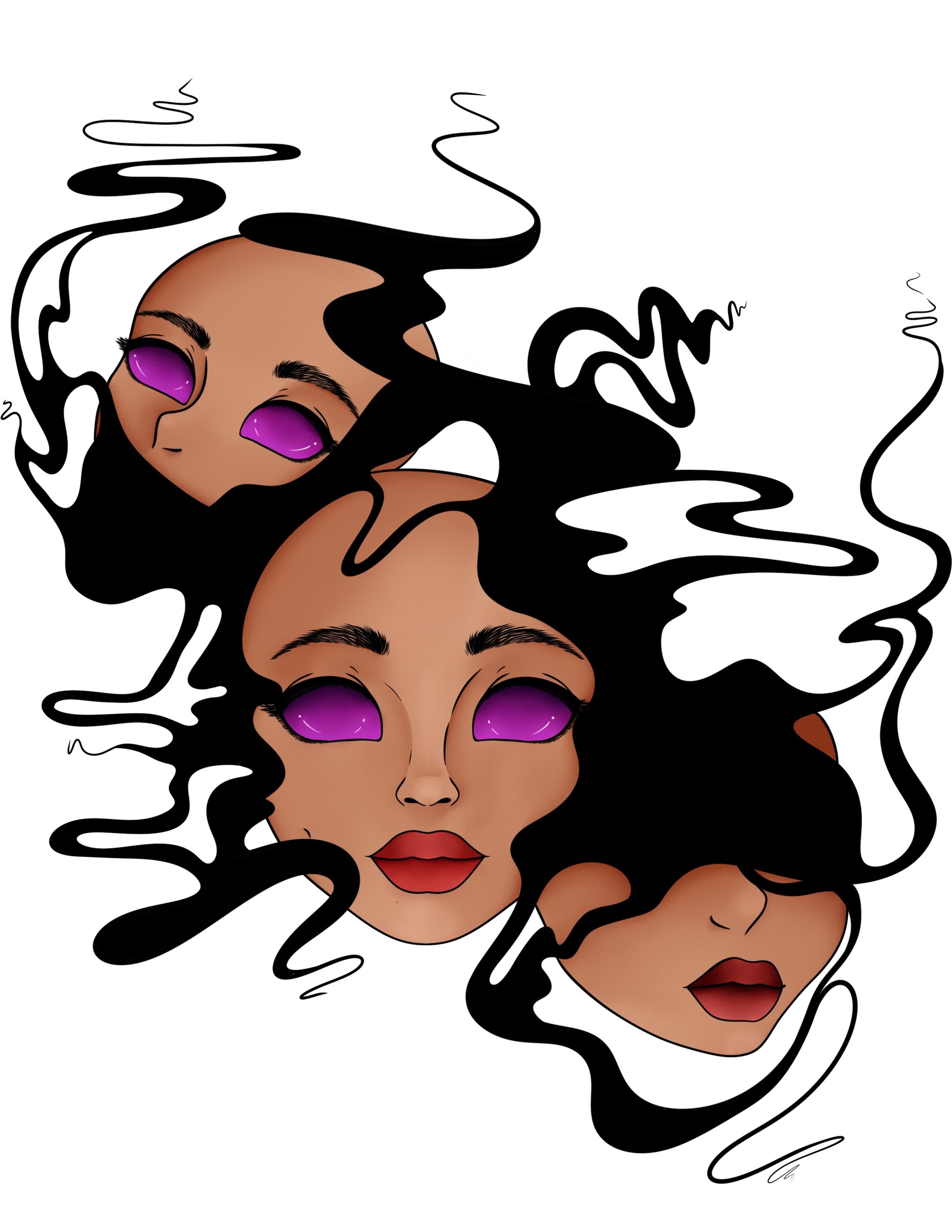
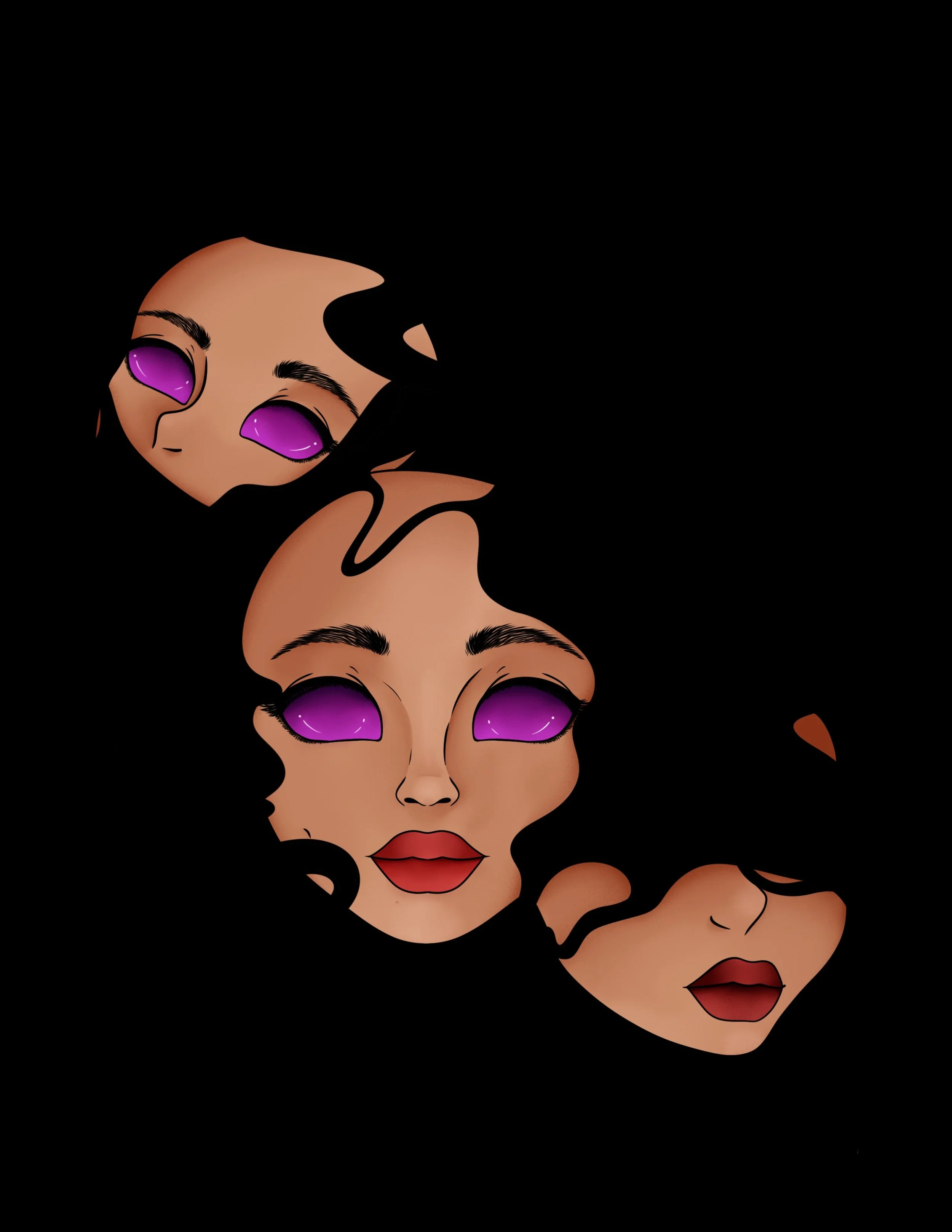
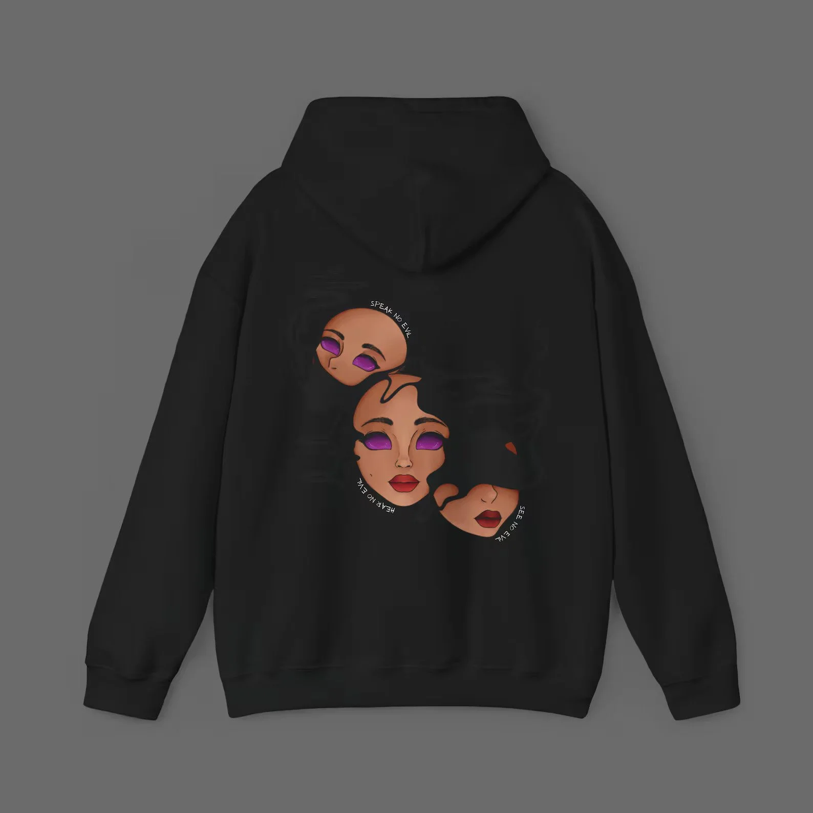
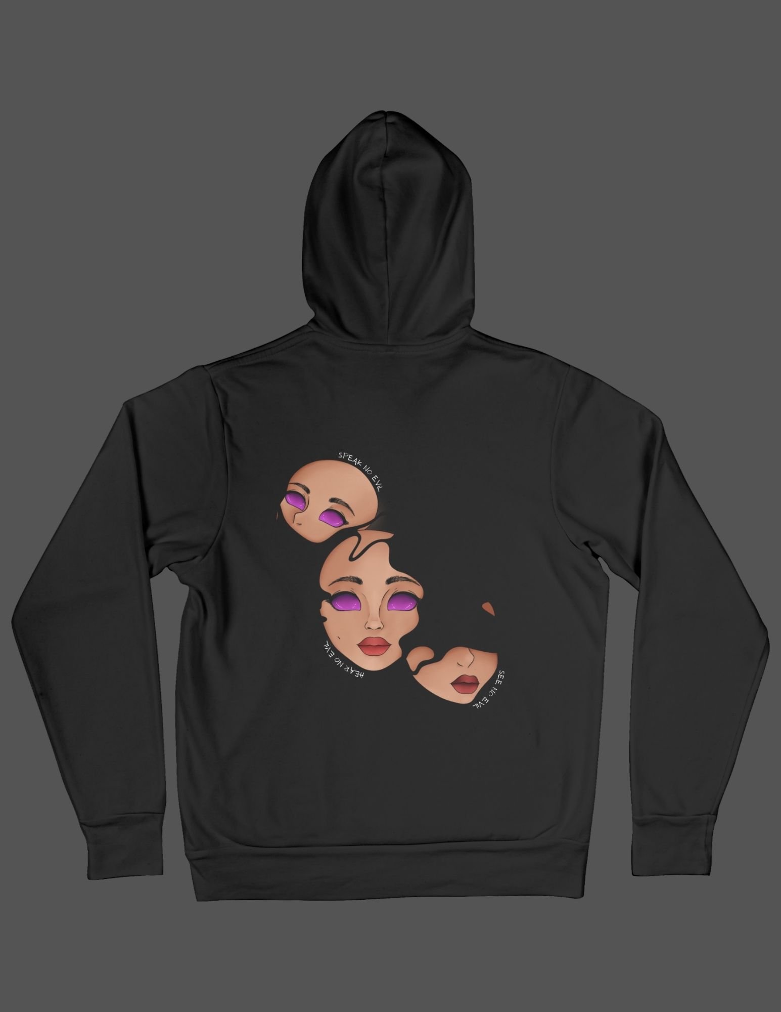
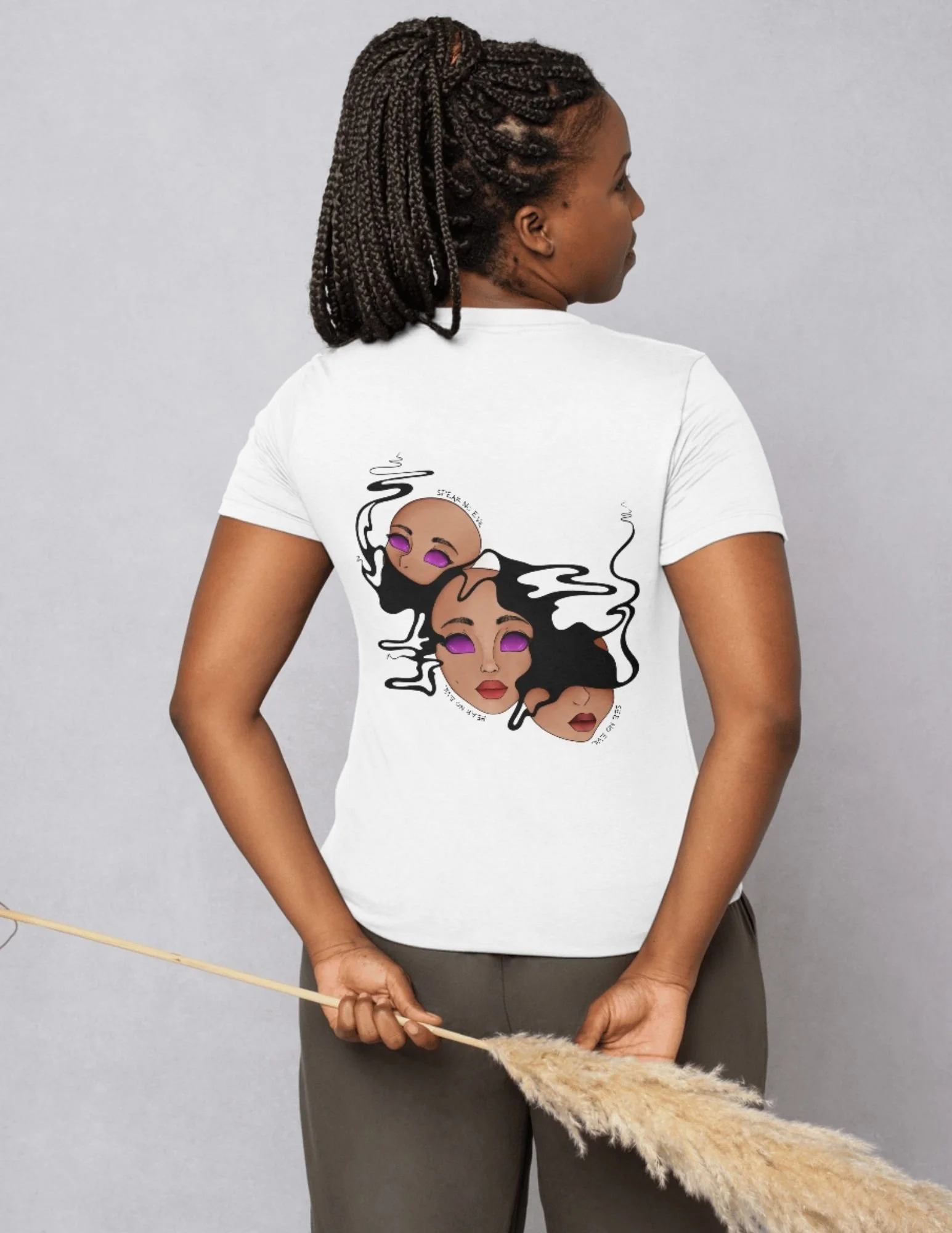
See No Evil, Hear No Evil, Speak No Evil
This design presents a modern interpretation of “See No Evil, Hear No Evil, Speak No Evil” through the use of smoke as a symbolic barrier. The smoke partially obscuring the faces represents intentional blindness, selective hearing, and silence—how truth can be hidden, distorted, or dismissed without ever fully disappearing.
Each face emerges through the smoke rather than being physically covered, suggesting that evil is not absent but deliberately ignored. The smoke acts as a metaphor for denial, avoidance, and moral ambiguity, emphasizing how perception can be clouded rather than removed. This choice shifts the message from physical restraint to psychological and emotional suppression.
The fragmented faces reinforce the idea that ignoring reality fractures identity and self-awareness. The purple eyes remain visible through the haze, symbolizing consciousness and inner knowing that persists even when one chooses not to see, hear, or speak. The contrast against the black hoodie strengthens the theme of concealment and quiet resistance.
Overall, the design challenges the viewer to reflect on the consequences of silence and avoidance, questioning whether choosing not to see, hear, or speak is an act of peace—or complicity.
Progress
Mock-Ups
Materials used:
Procreate
Learning Objectives & Skills Demonstrated:
☾ Concept Development & Visual Storytelling
☼ This project demonstrates the ability to develop a clear visual concept that communicates emotion and identity through symbolic imagery. Facial expressions, fragmentation, and text placement were used intentionally to convey layered meaning and narrative depth.
☾ Stylized Portrait Illustration
☼ The illustration strengthened skills in stylized facial construction, focusing on simplified anatomy, exaggerated features, and controlled proportions while maintaining recognizability and expressive clarity.
☾ Digital Colour Rendering & Value Control
☼ This project required careful use of colour, highlights, and shadow to model form on a dark background. Strategic value contrast was applied to ensure facial features remained legible and dimensional when printed on black fabric.
☾ Typography Integration within Illustration
☼ Circular text elements were integrated directly into the artwork, reinforcing the composition rather than competing with it. This demonstrates an understanding of how typography can function as both visual and conceptual support within an illustration.
☾ Composition for Apparel Design
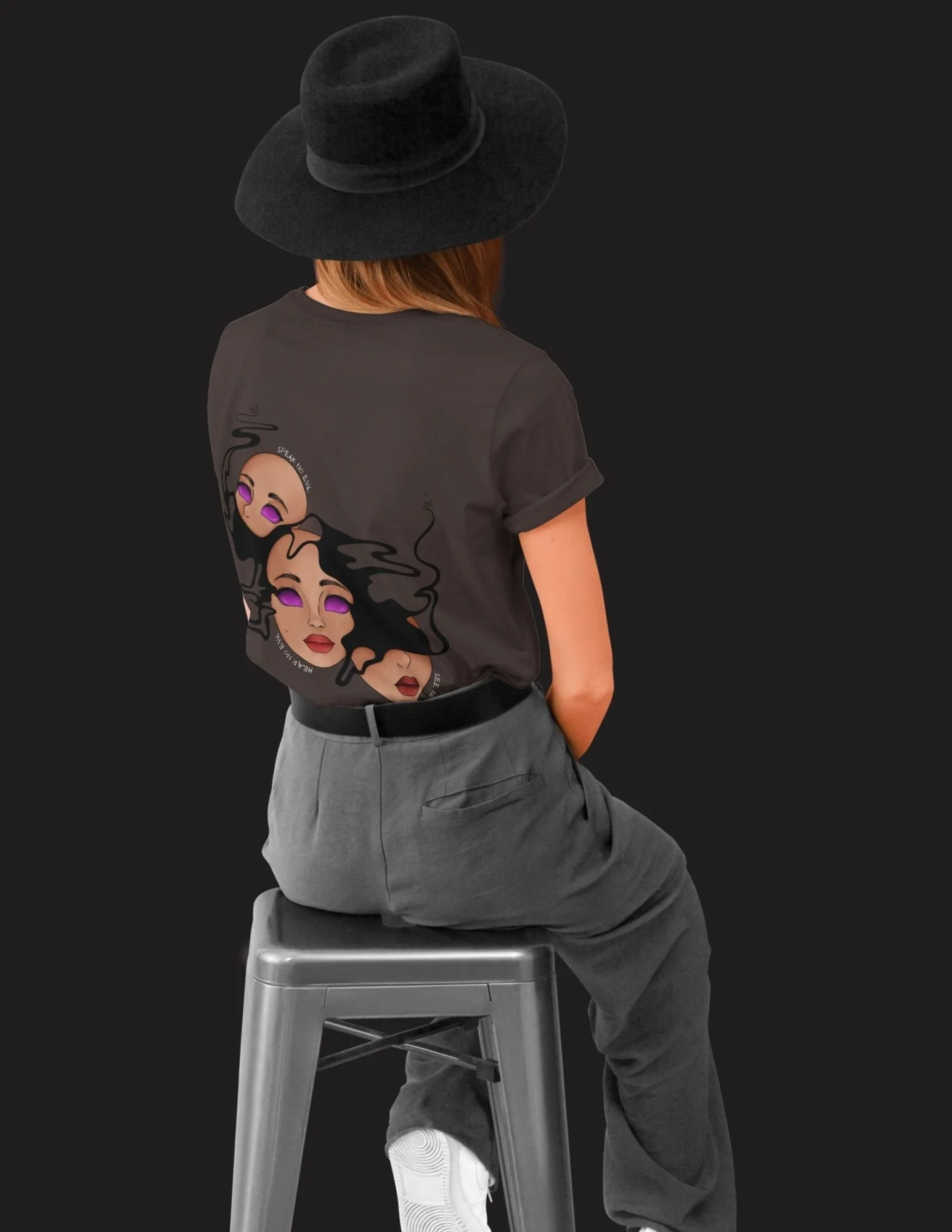
☼ The layout was designed specifically for hoodie placement, emphasizing central balance and negative space. Scale and positioning were considered to ensure the artwork reads clearly from a distance and conforms naturally to the garment’s shape.
Challenges & Solutions
☾ Balancing expressive abstraction with facial clarity
✶ Fragmenting the face into multiple floating elements risked losing recognizability and emotional focus if proportions or placement became unclear.
☼ To resolve this, I established a central facial anchor and built all fragmented elements around consistent proportions. Each face variation was aligned using shared eye level, nose placement, and scale relationships to maintain cohesion while allowing expressive distortion.
☾ Maintaining visual contrast on a dark garment
✶ Dark hoodie fabric can cause illustrated details to visually sink or lose definition if values are not carefully controlled.
☼ I intentionally increased value contrast and saturation in the skin tones, eyes, and lips while keeping the surrounding background minimal. Highlights and soft gradients were used strategically to separate the illustration from the fabric and ensure readability at a distance.
☾ Integrating typography without overpowering the illustration
✶ Incorporating text directly into the artwork risked distracting from the faces or disrupting the composition’s balance.
☼ I curved the typography to follow the natural flow of the facial forms, treating it as a compositional element rather than a separate layer. Subtle sizing and spacing allowed the text to support the narrative without competing for attention.
☾ Designing for apparel scale and placement
✶ Artwork that reads well on screen can become distorted or unclear when transferred onto a physical garment.
☼ I tested scale and placement within a hoodie mockup early in the process, adjusting spacing and negative areas to accommodate fabric folds and body movement. This ensured the design remained visually centred and impactful when worn.
☾ Controlling emotional tone through colour and expression
✶ Conveying a cohesive emotional message using limited facial elements required careful control to avoid visual noise or conflicting moods.
☼ I unified the expressions through a restrained colour palette and repeated visual motifs, such as consistent eye shapes and lip tones. This allowed the design to communicate introspection and identity while remaining visually harmonious.