Fatty Cat Studio - Student Branding Project
This project was created as a conceptual exercise to explore brand development and mobile-first website design through a fictional business. The objective was to design a cohesive brand identity and translate it into a functional, visually engaging mobile interface that reflects both the brand’s personality and its target audience.
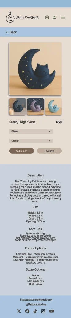
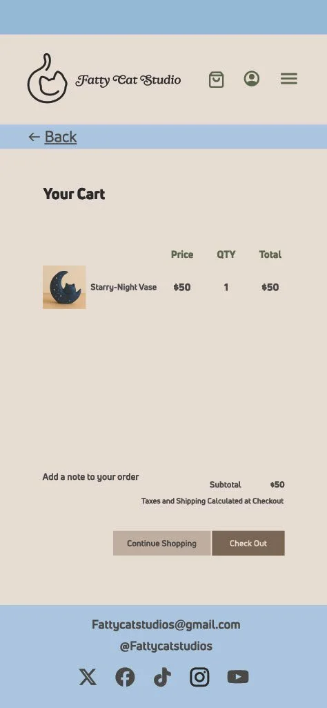
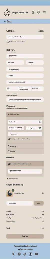
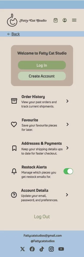
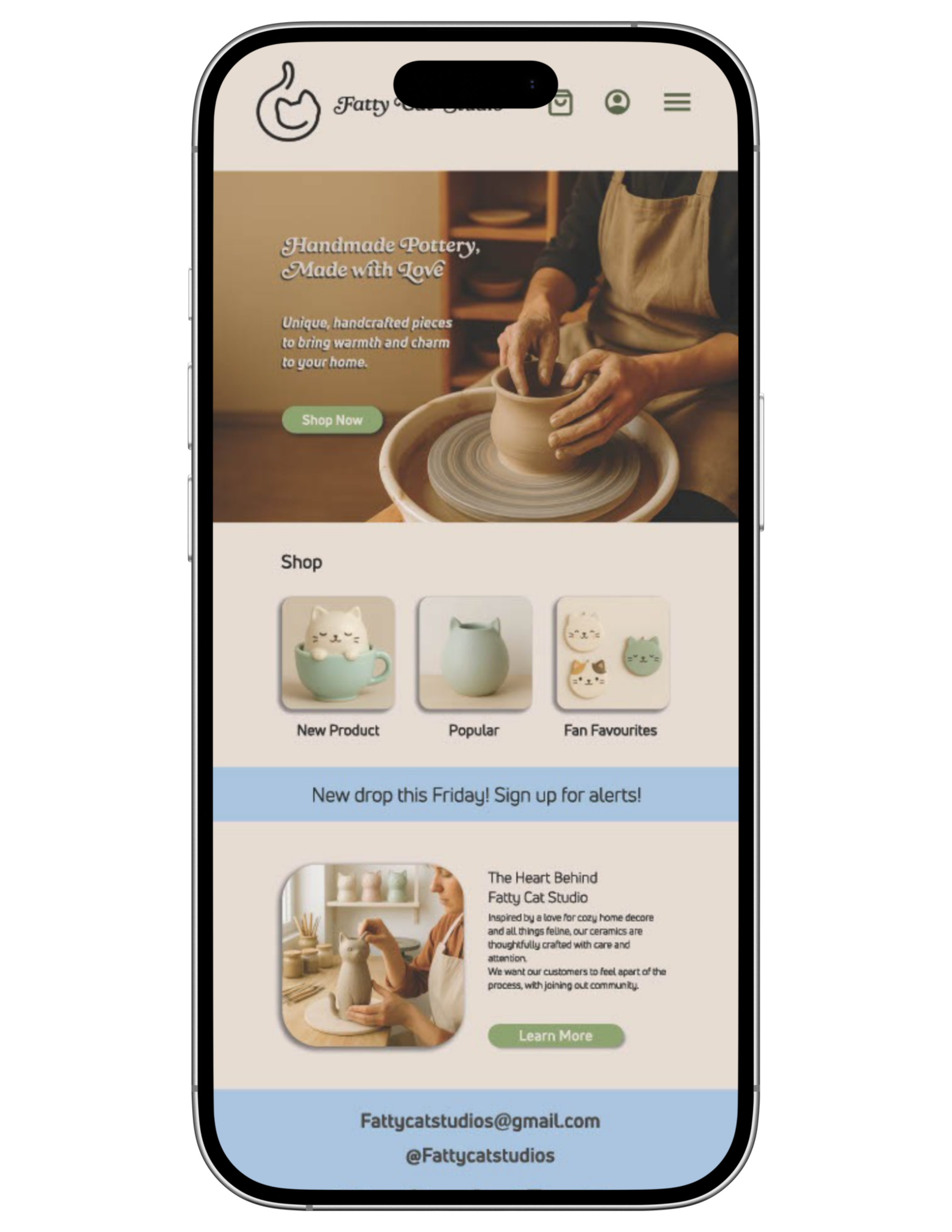
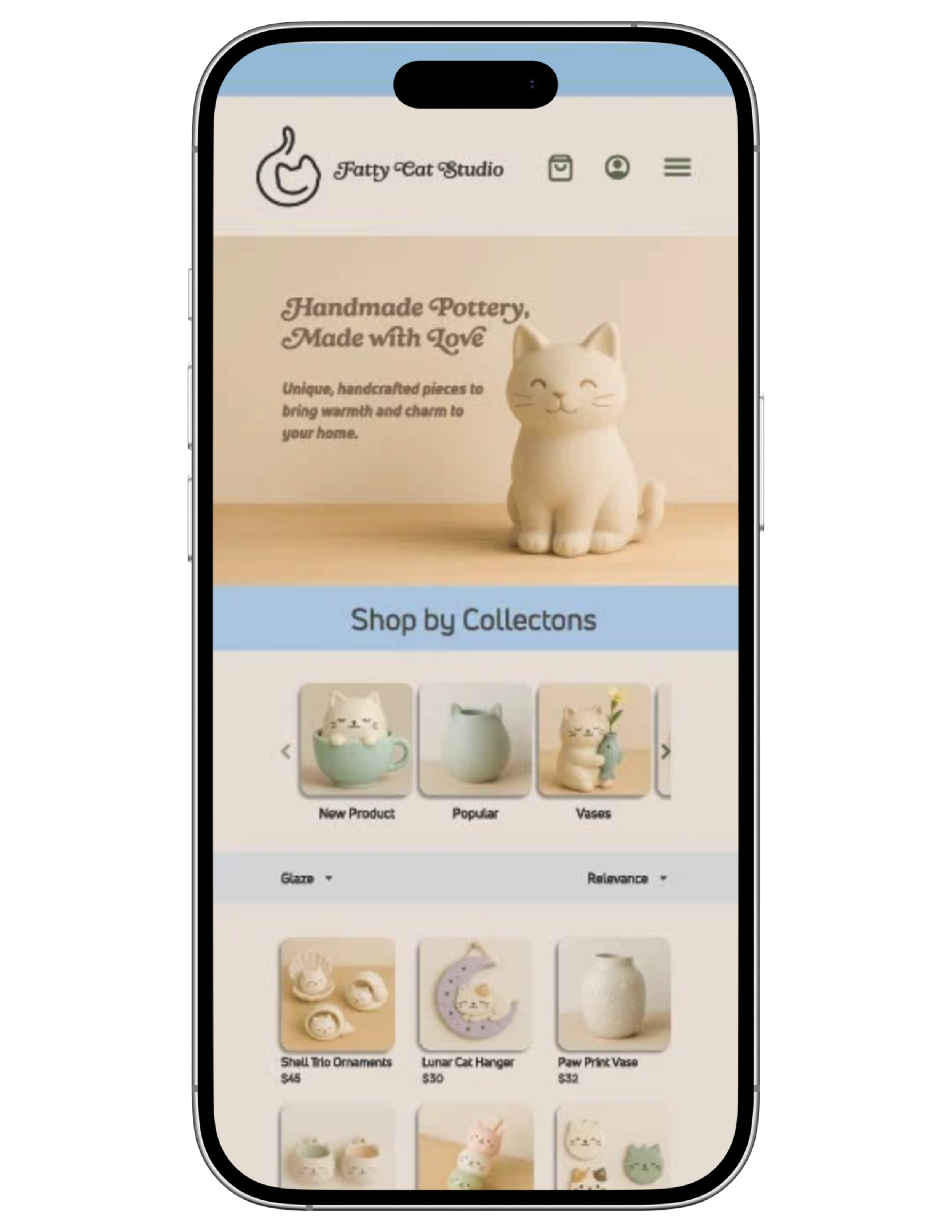
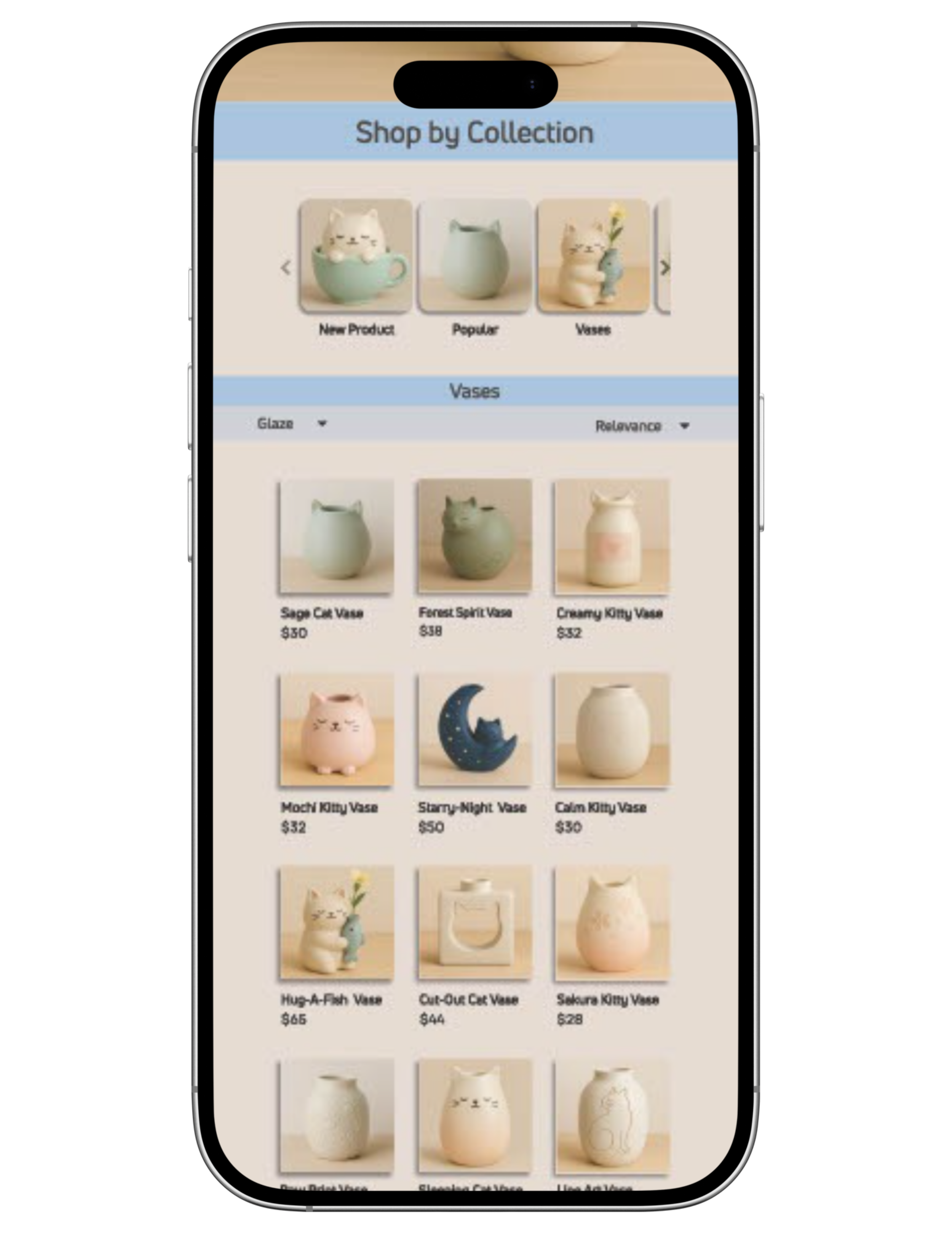
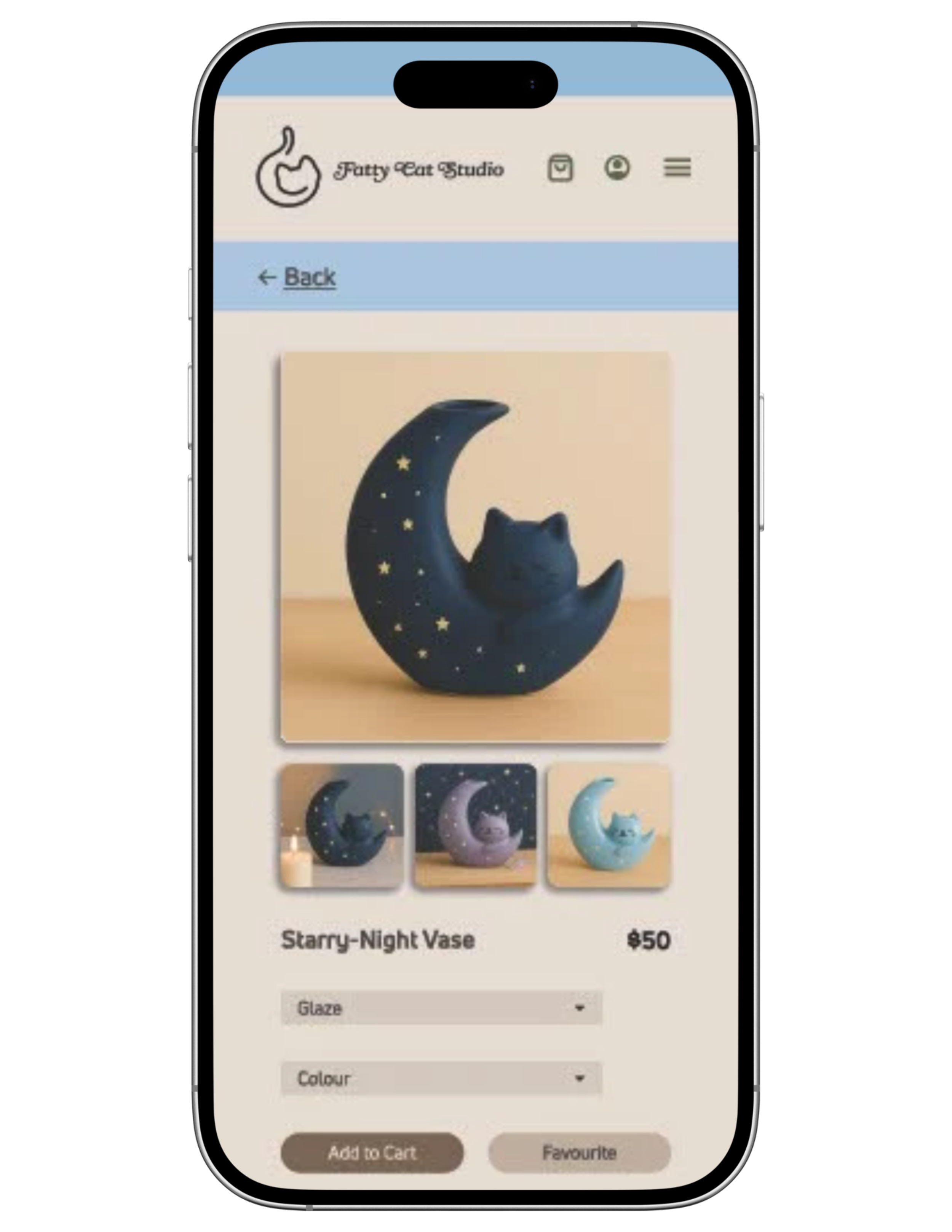
The made-up store, Fatty Cat Pottery, was developed to simulate a small handmade business selling ceramic goods. The brand was intentionally positioned as warm, playful, and approachable to appeal to adult consumers who value handmade products, giftable items, and small-batch creators. This concept provided an opportunity to practice designing for an e-commerce experience while balancing aesthetics, usability, and storytelling.
A mobile-first approach was prioritized to reflect current user behaviour, focusing on clear navigation, readable typography, and an intuitive shopping experience. Layout decisions emphasized simplicity and flow, allowing products to remain the focal point while supporting them with soft colours, organic shapes, and friendly visual elements. The colour palette and typography were chosen to reinforce the handmade, cozy nature of the brand while maintaining accessibility and consistency across screens.
Overall, this project demonstrates the process of building a brand from concept to execution and applying that identity thoughtfully within a mobile website interface. It reflects an understanding of user-centred design, visual hierarchy, and how branding decisions directly influence usability and engagement in a digital environment.
Video Mockup
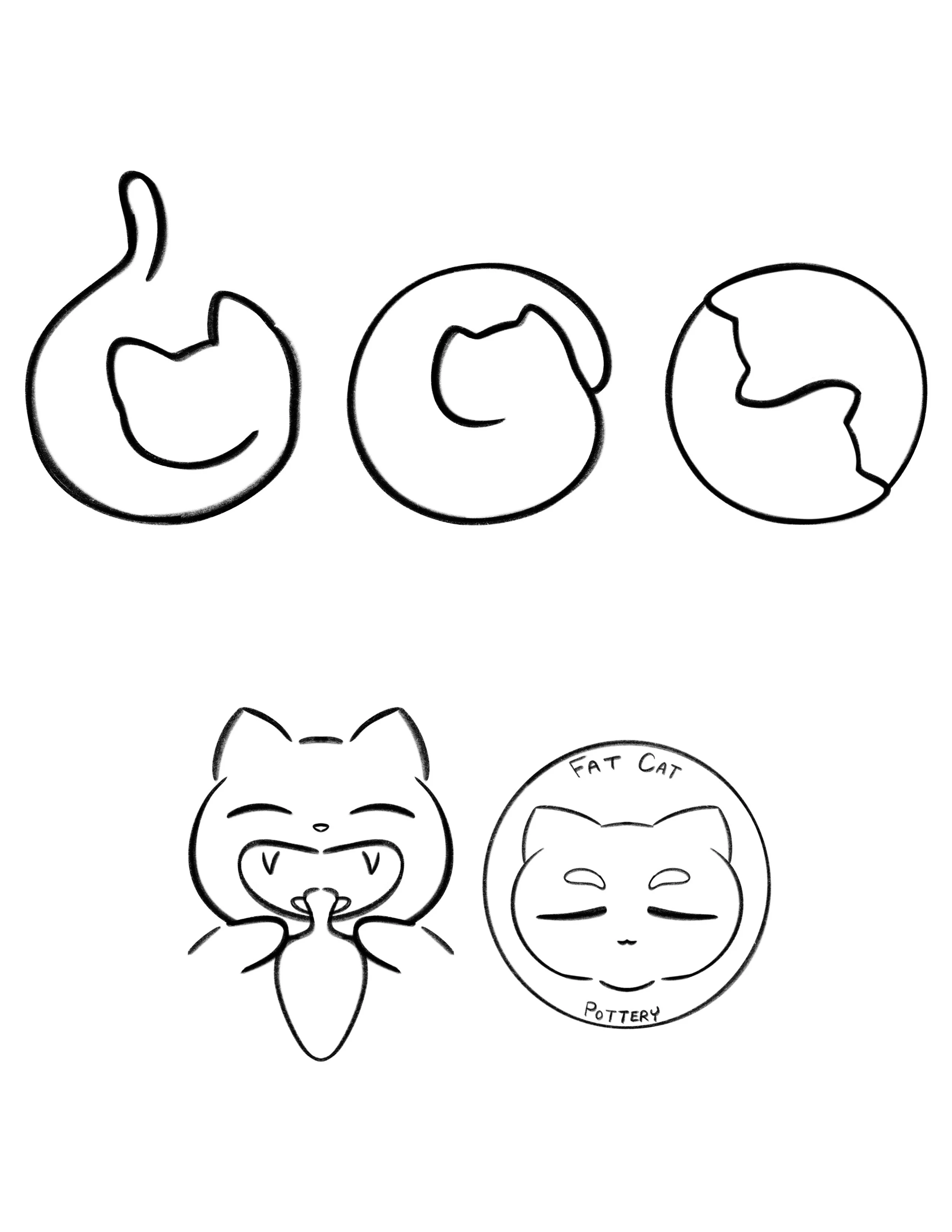
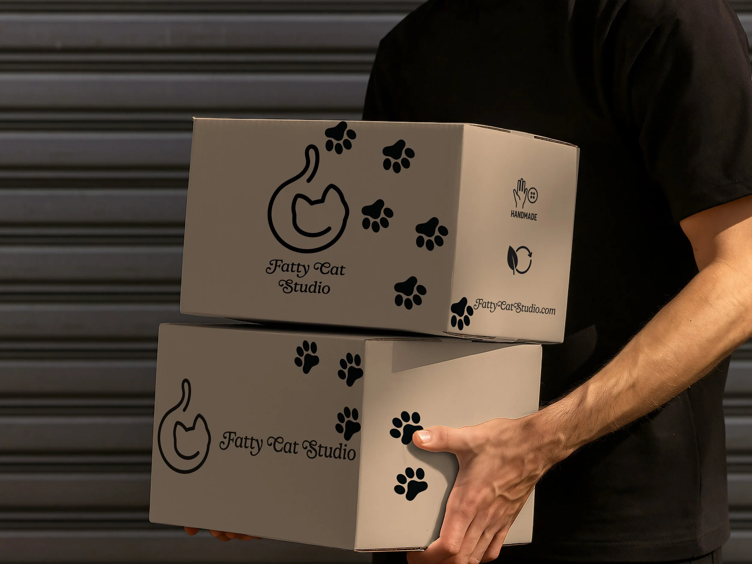
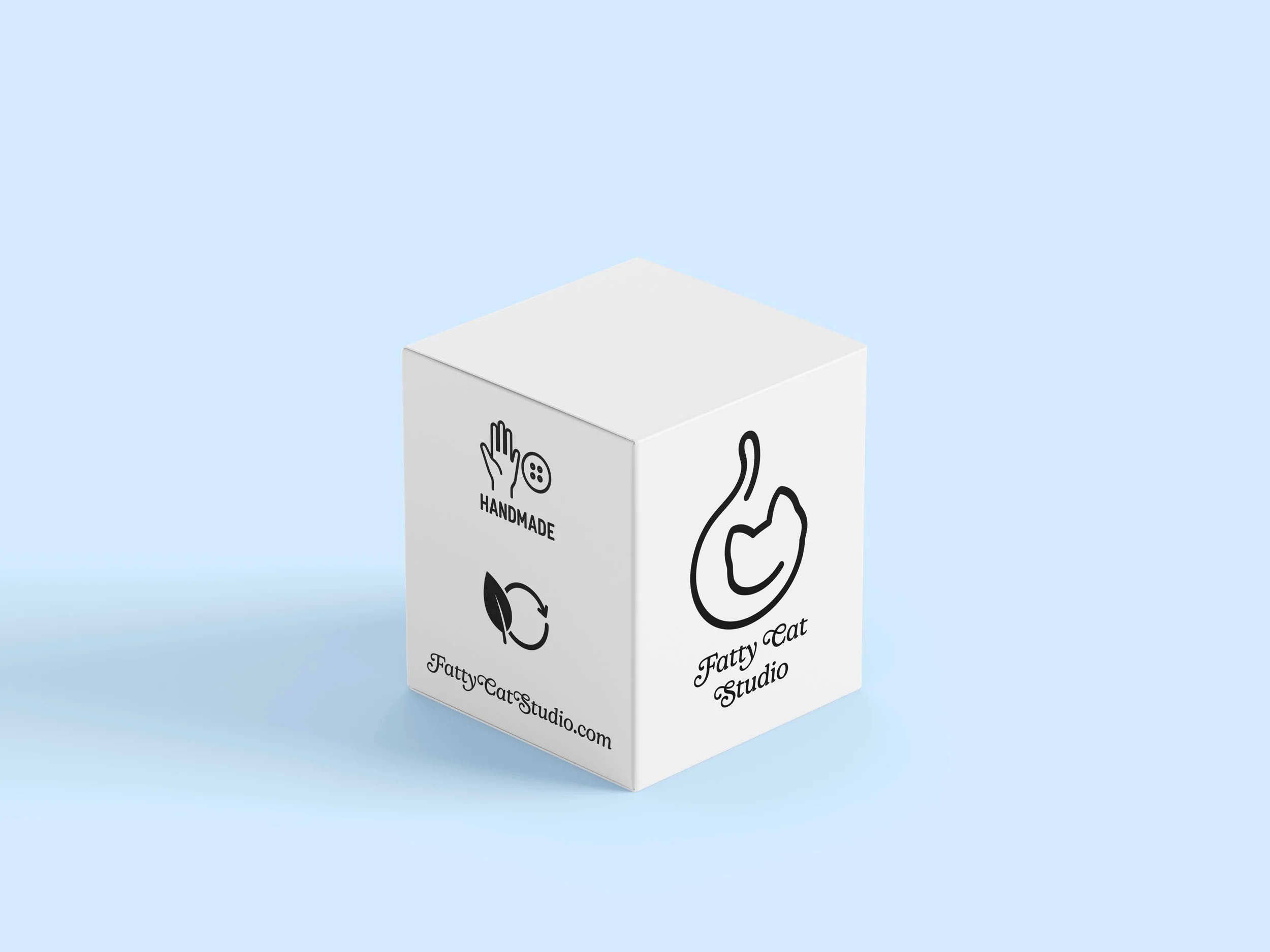
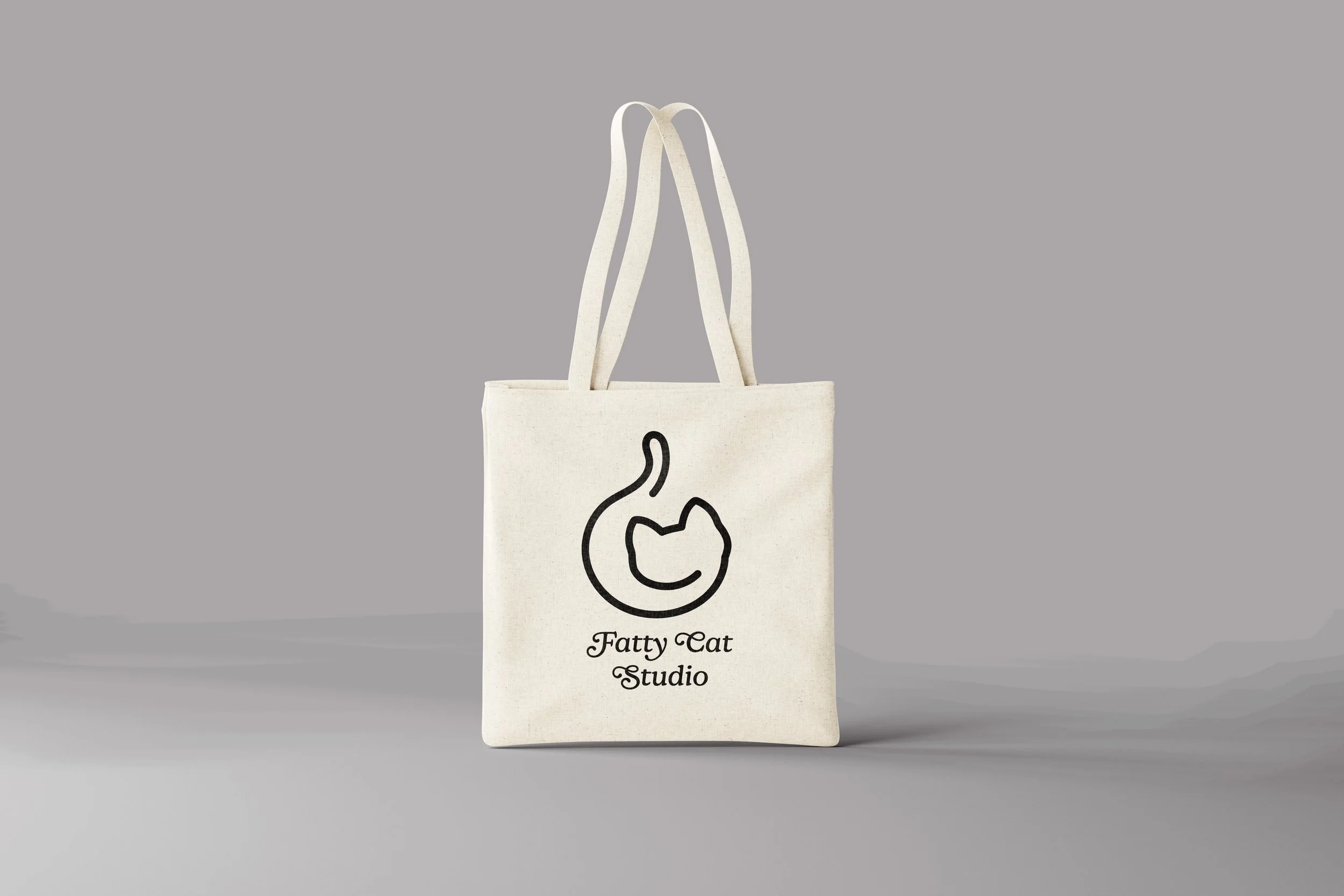
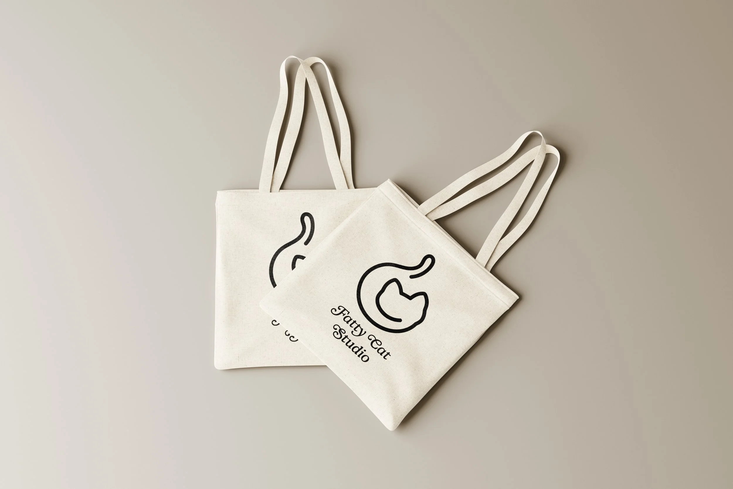
Logo


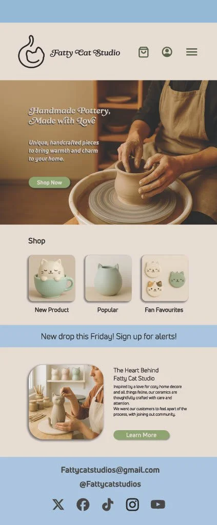
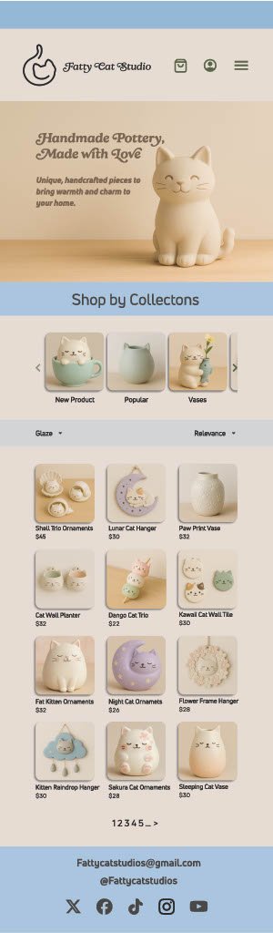
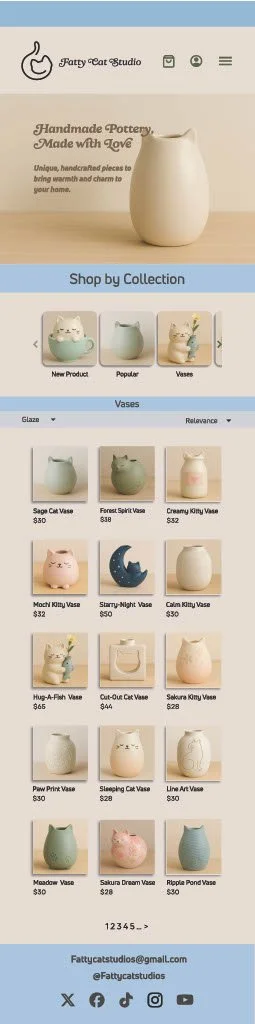
Mobile Website

Mockups- App
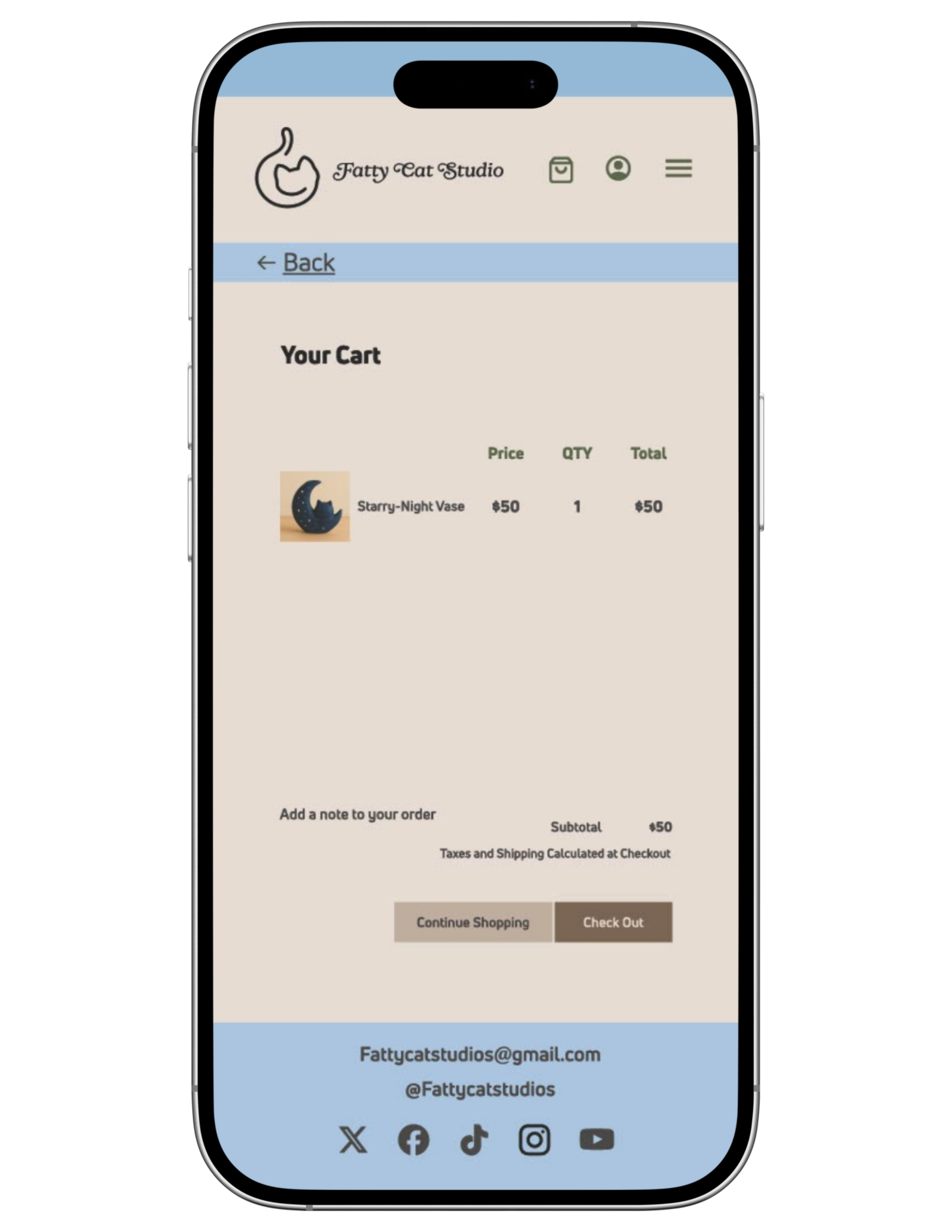
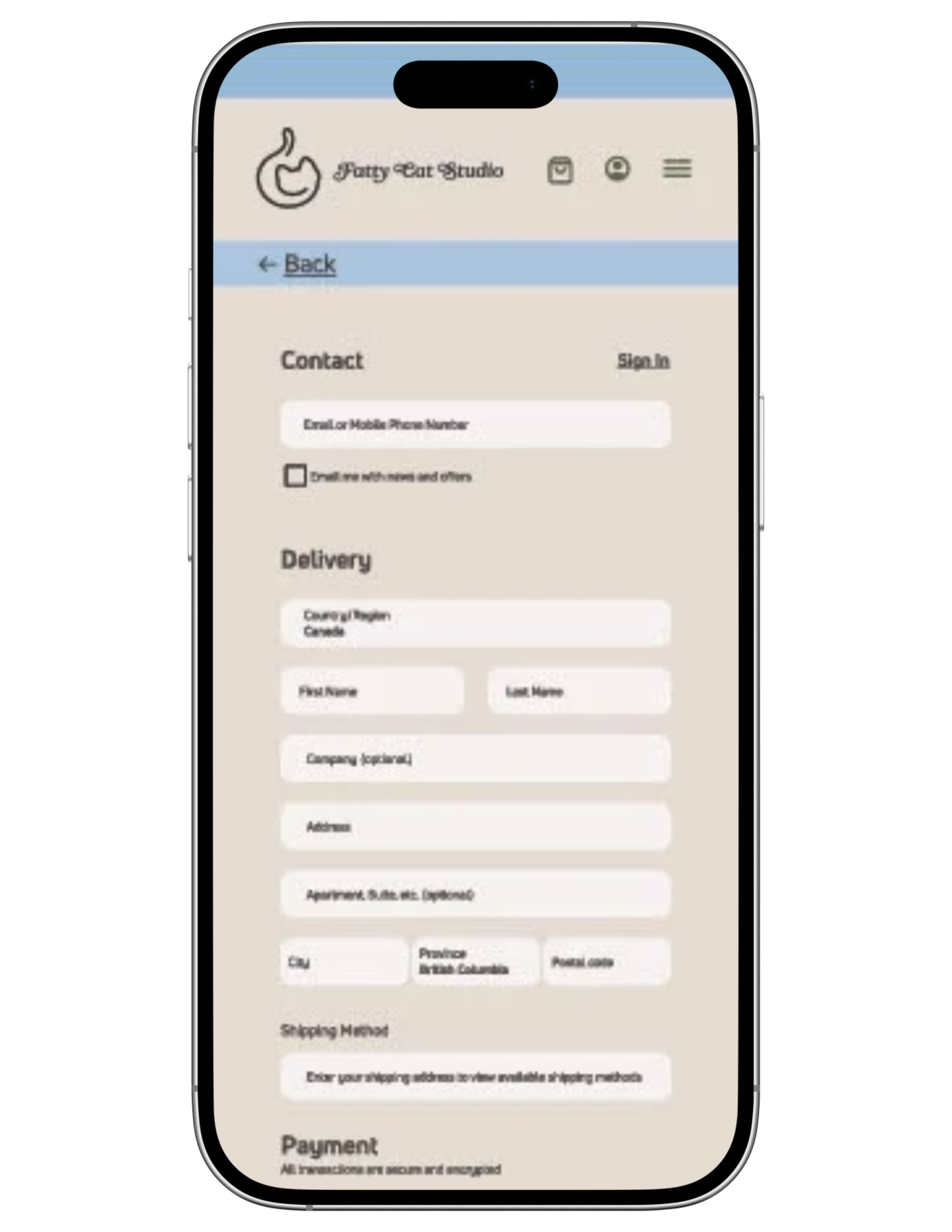
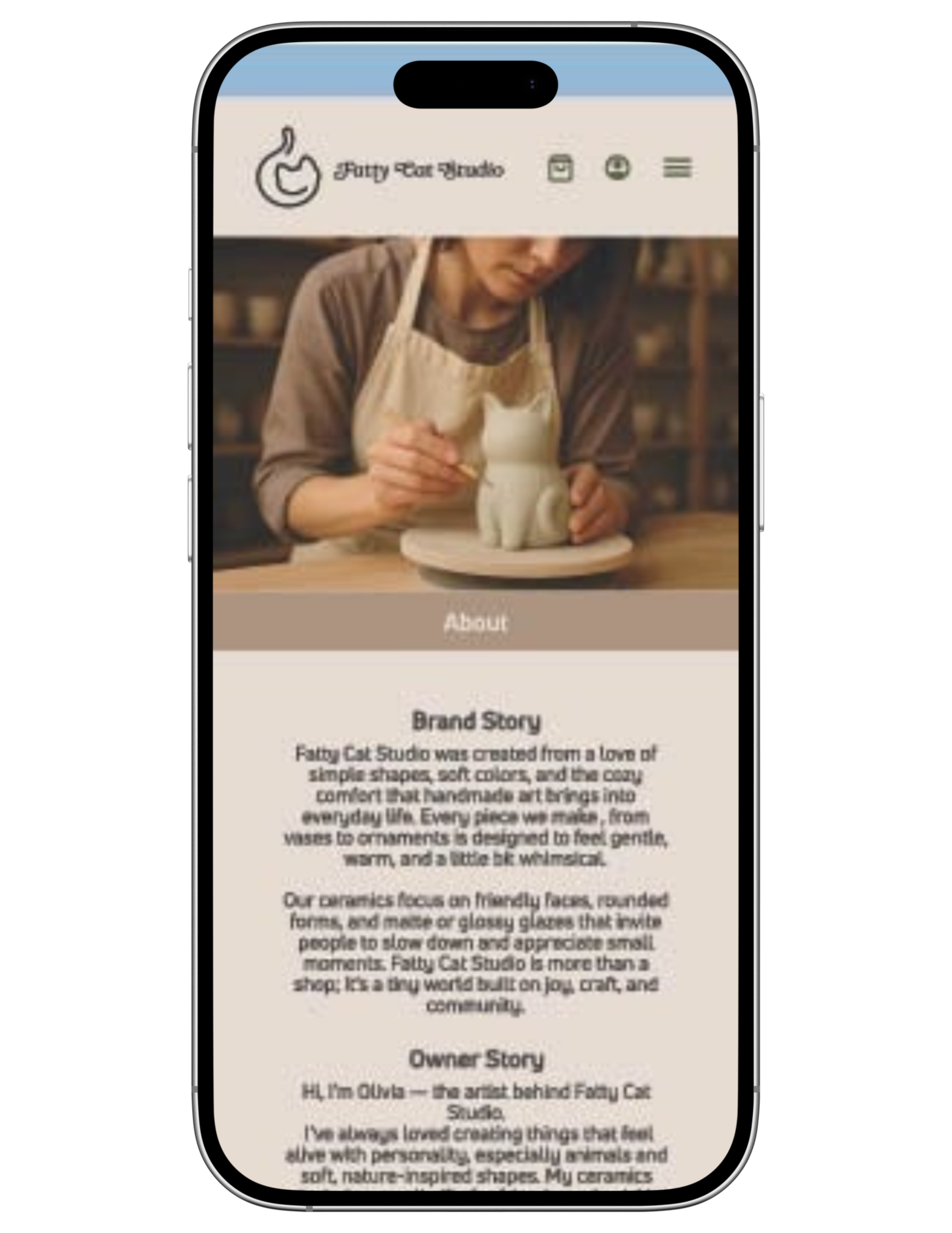
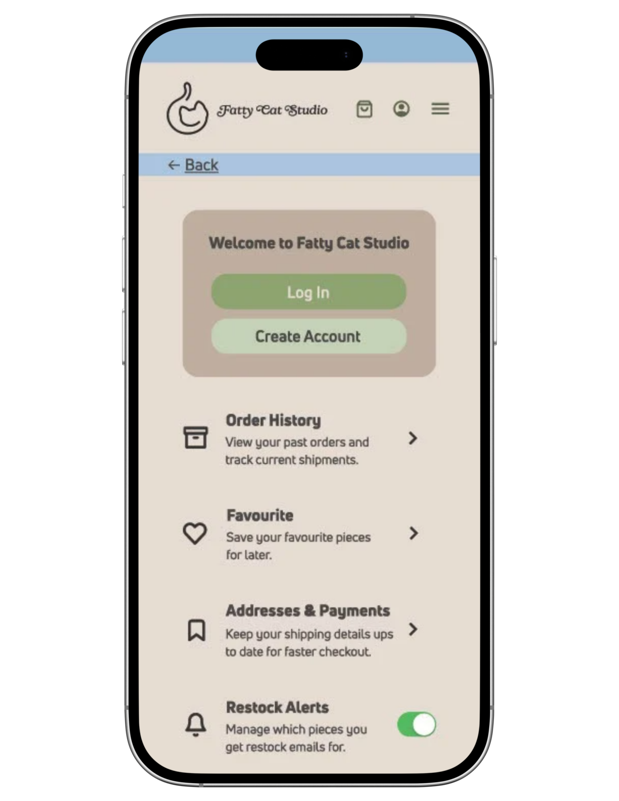
Mockups
Materials used:
Procreate
Illustrator
Photoshop
Figma
Learning Objectives & Skills Demonstrated:
☾ Brand Concept Development
☼ This project strengthened the ability to create a cohesive brand identity from the ground up, including defining brand personality, values, visual tone, and target audience before applying it consistently across a digital platform.
☾ Mobile-First Website Design
☼ The project reinforced the importance of designing for mobile interfaces first, prioritizing clear navigation, readable typography, and intuitive user flow to reflect real-world user behaviour.
☾ User Interface (UI) Layout & Visual Hierarchy
☼ This project developed skills in organizing content through hierarchy, spacing, and scale, ensuring that key information and calls to action are easily accessible on small screens.
☾ Typography Selection & Readability
☼ Thoughtful font choices and typographic hierarchy were applied to enhance readability and reinforce brand personality while maintaining accessibility across mobile devices.
☾ Colour Theory & Brand Consistency
☼ A controlled colour palette was used to support the brand’s mood and handmade aesthetic while maintaining visual consistency and usability throughout the website interface.
☾ Digital Design Workflow & Iteration
☼ The project demonstrates an understanding of digital design workflow, including concept development, wireframing, refinement, and revision based on usability and visual clarity.
Challenges & Solutions
☾ Establishing a cohesive brand from a fictional concept
✶ Creating a believable brand for a made-up store required clear direction to avoid visual inconsistency or an underdeveloped identity.
☼ To address this, I defined the brand’s personality, target audience, and tone early in the process. Visual decisions such as colour palette, typography, and imagery were guided by this foundation, ensuring consistency across all pages of the mobile interface.
☾ Designing for limited mobile screen space
✶ Mobile interfaces restrict available space, making it challenging to present information clearly without overwhelming the user.
☼ I prioritized content hierarchy by focusing on essential information first, using spacing, scale, and simplified layouts. Navigation elements were kept minimal and intuitive to maintain clarity and ease of use.
☾ Balancing visual appeal with usability
✶ A strong visual style can sometimes interfere with readability and user experience if not carefully controlled.
☼ I tested colour contrast, font sizes, and layout spacing to ensure readability while maintaining the brand’s aesthetic. Decorative elements were used sparingly so that usability remained the primary focus.
☾ Maintaining consistency across multiple screens
✶ Ensuring that all pages felt connected while serving different functions posed a challenge in maintaining cohesion.
☼ I established reusable design elements such as consistent headers, button styles, and typographic hierarchy. This helped create a unified experience across the mobile interface while allowing each page to function independently.