Chibi’s Anime Goods & Collectibles —
Student Rebrand
This project is a hypothetical rebrand of Chibi’s Anime Goods & Collectibles, a family-owned shop known for its warm, community-focused atmosphere and love for Japanese pop culture. The redesign aims to capture the store’s sweet, nostalgic charm while giving it a more cohesive and memorable visual identity.
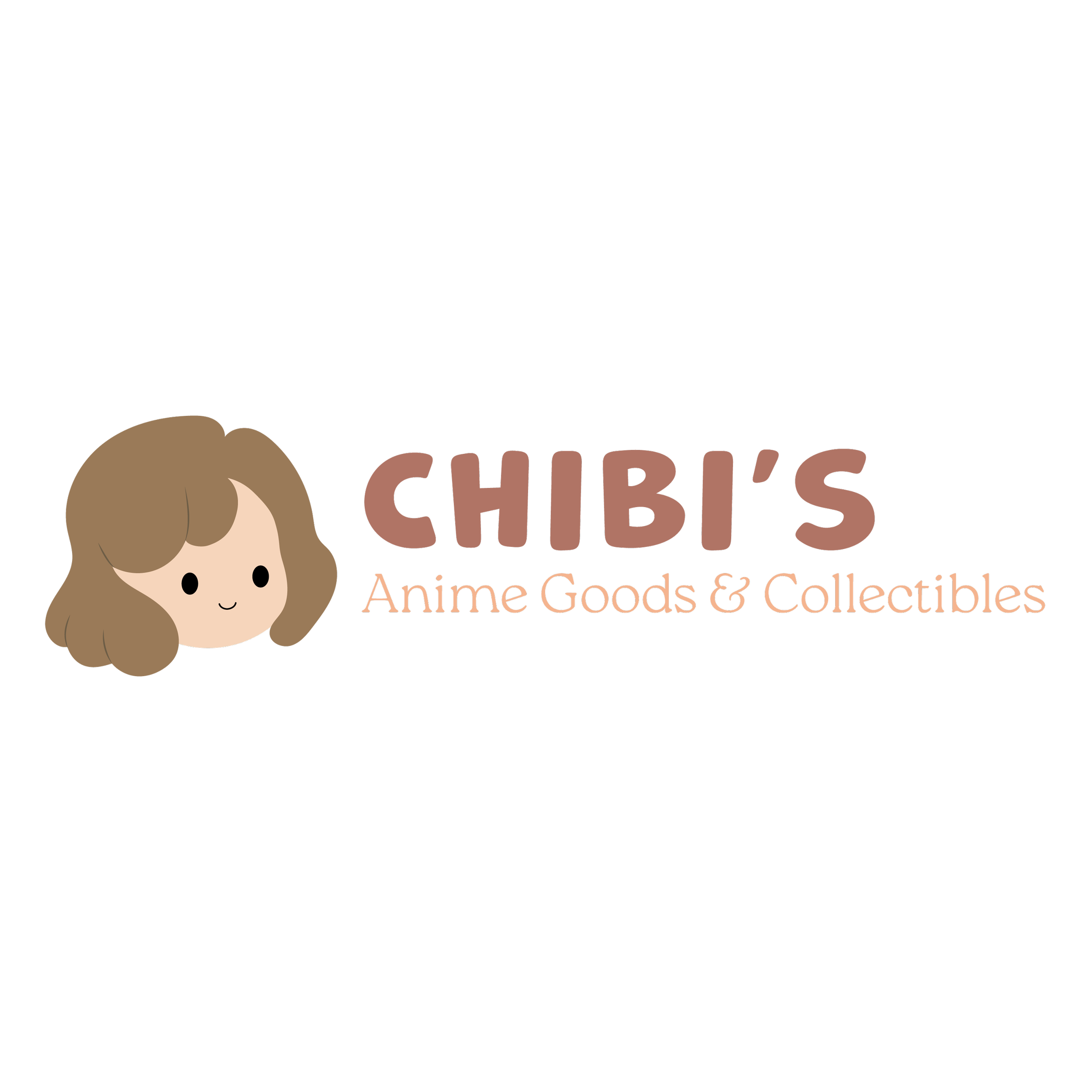
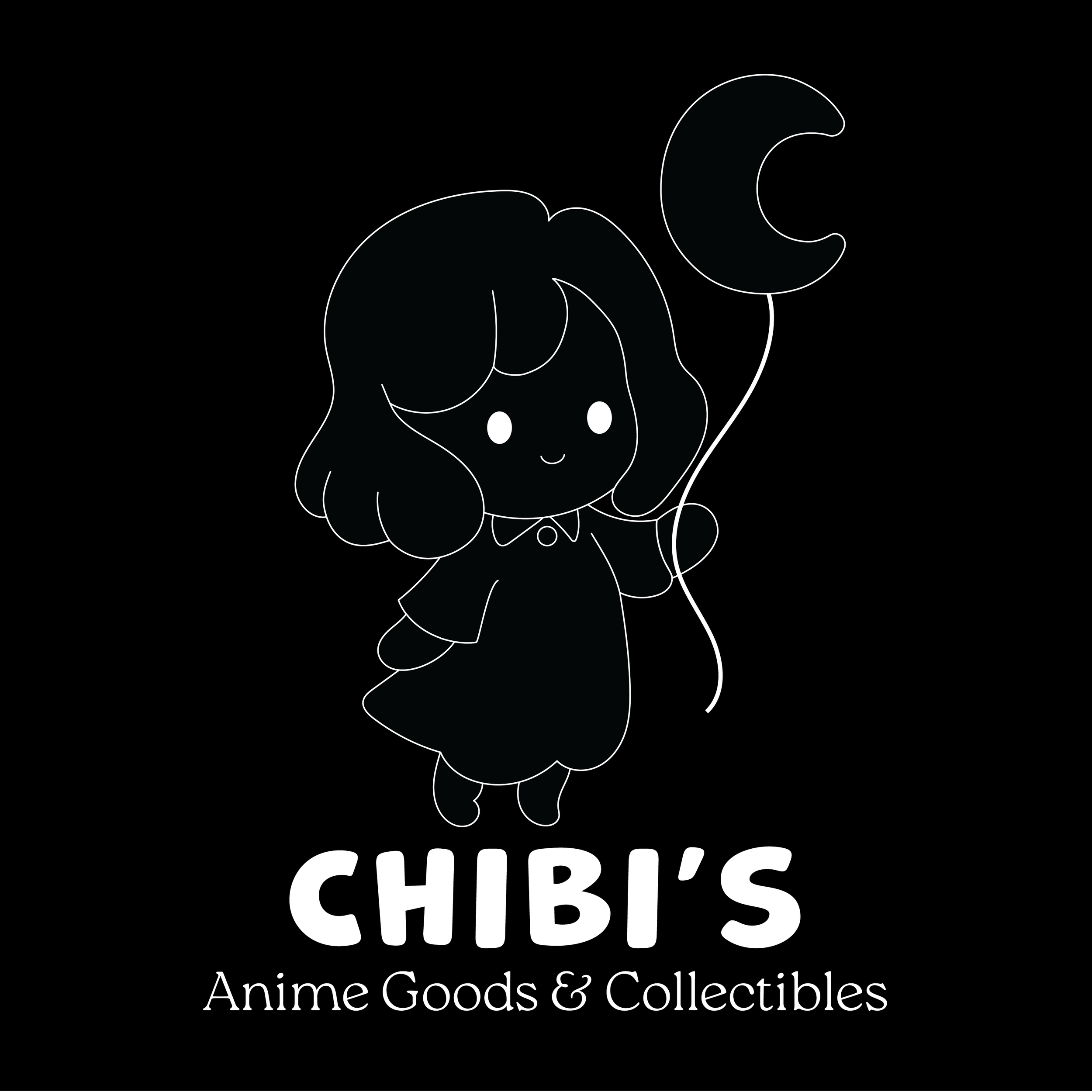
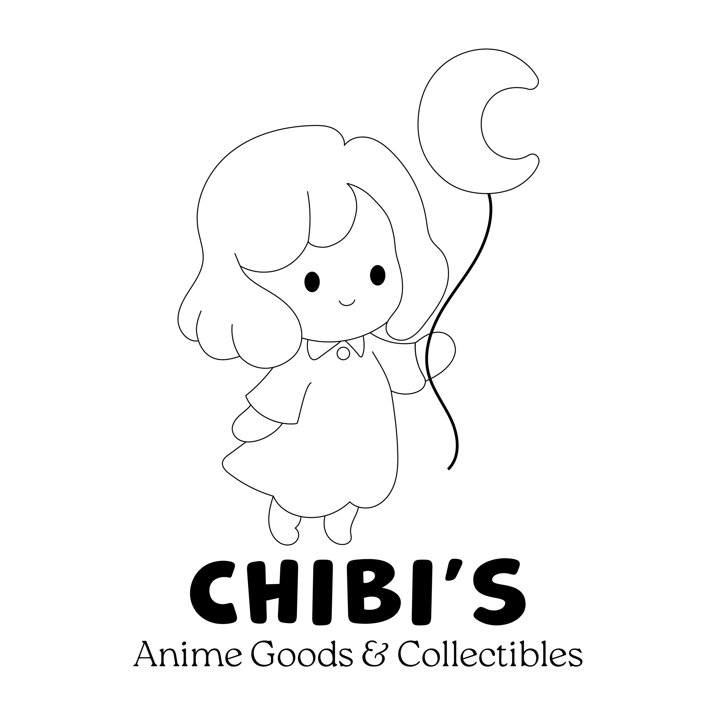
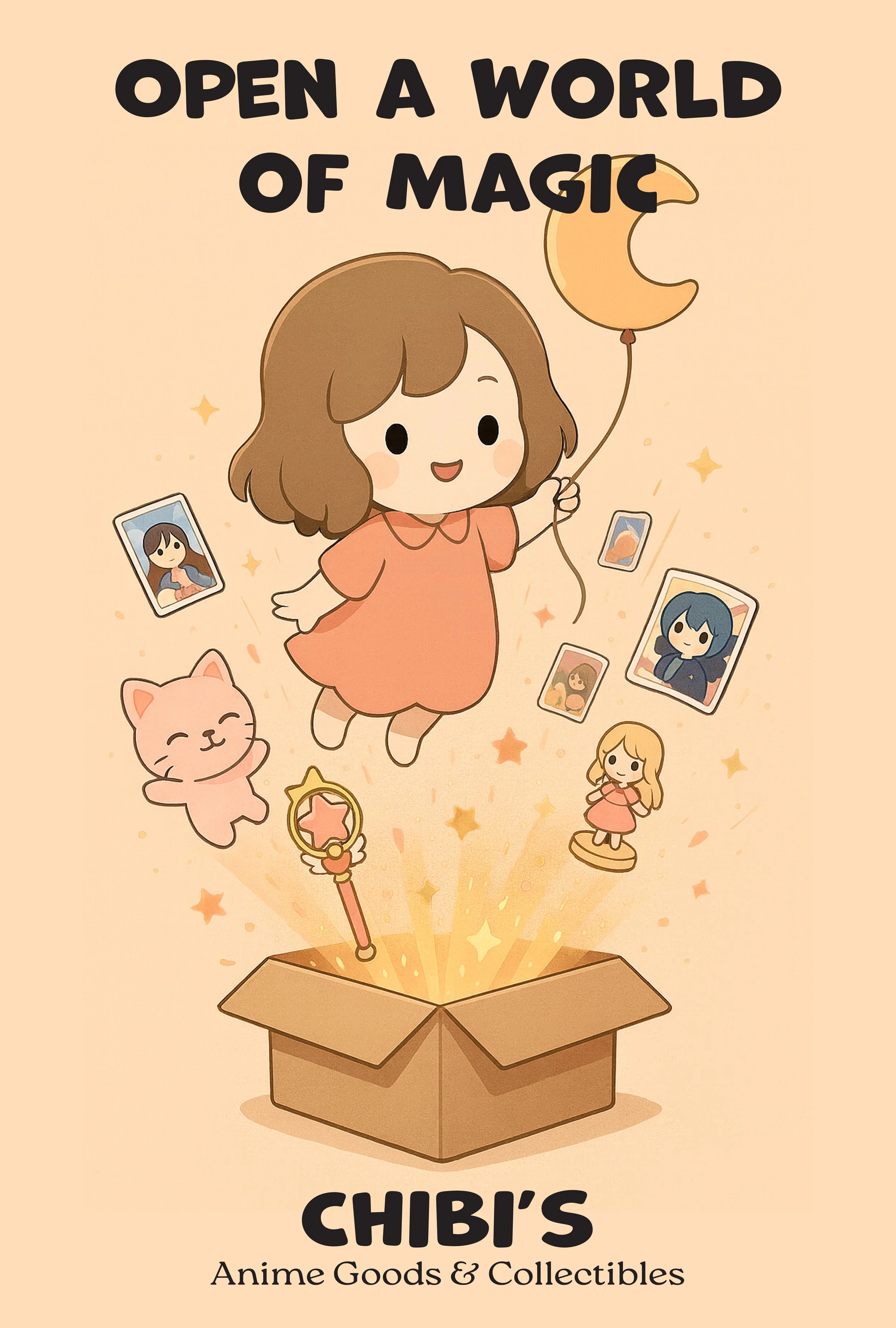
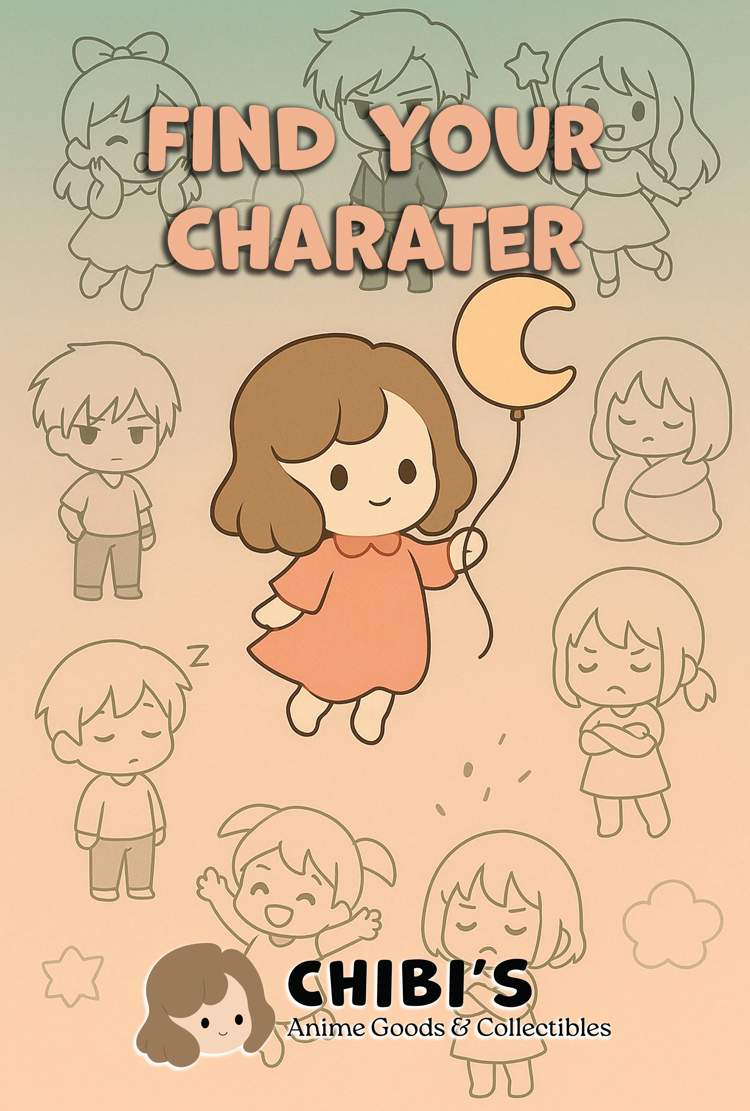
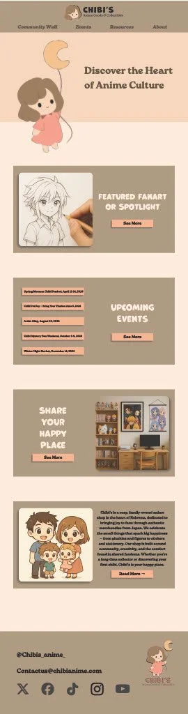
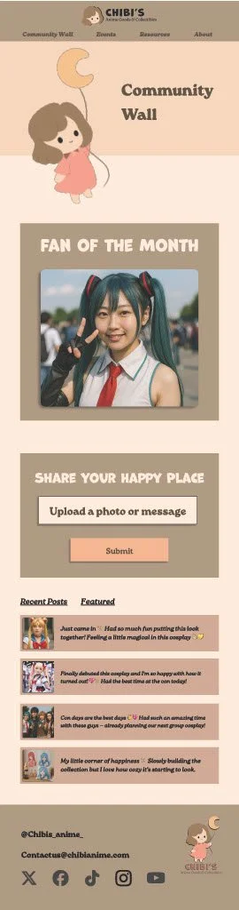
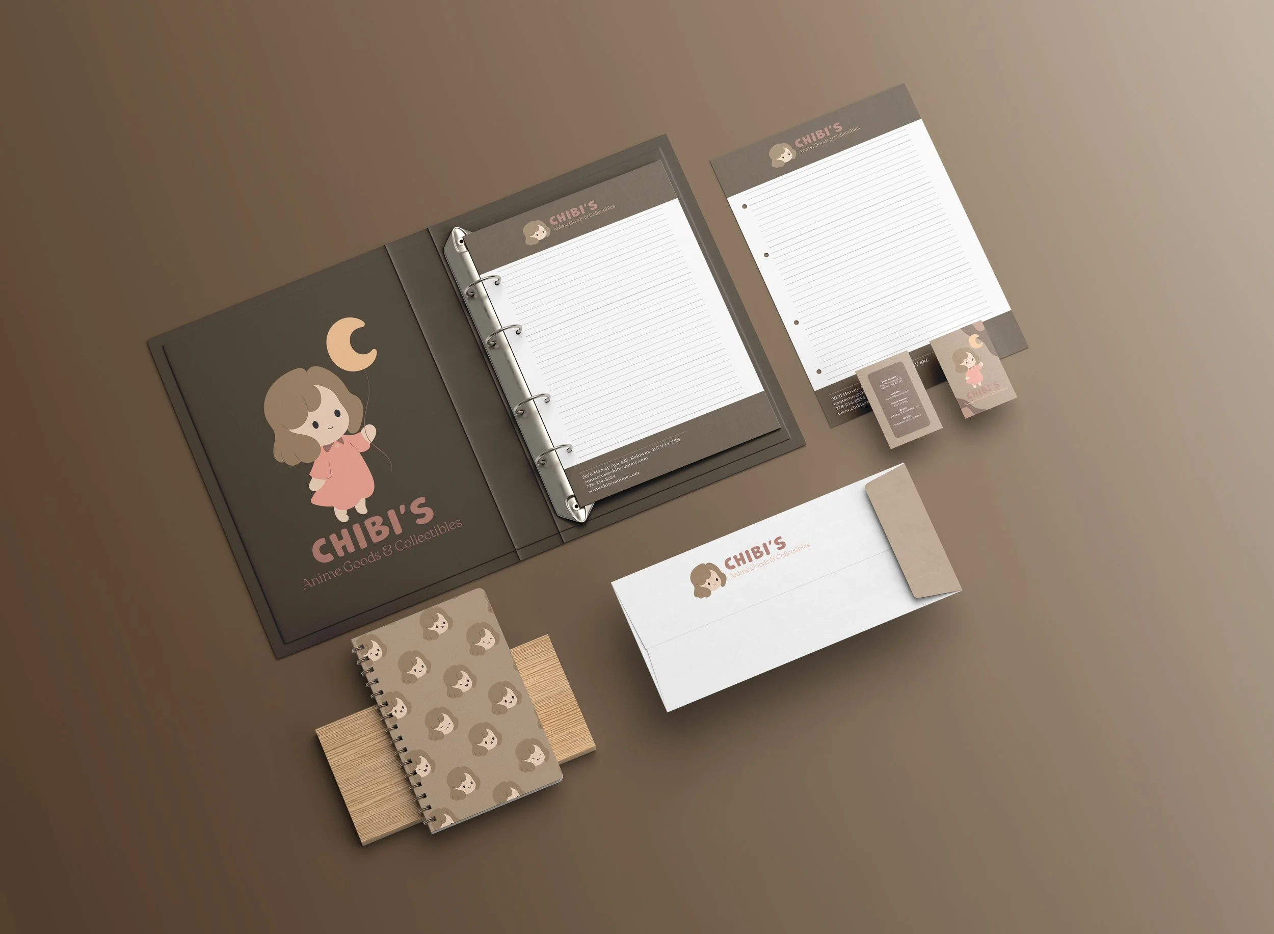
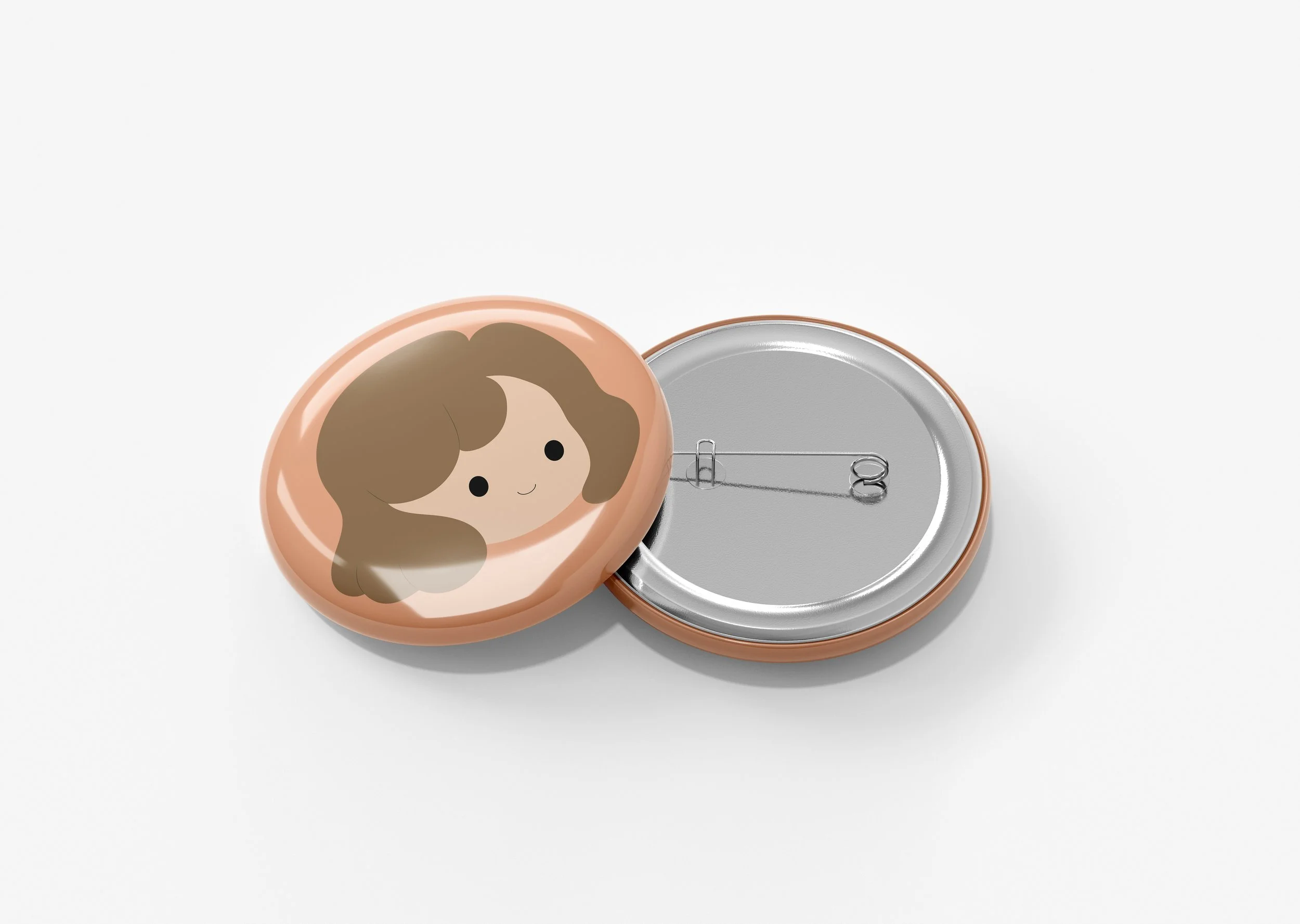
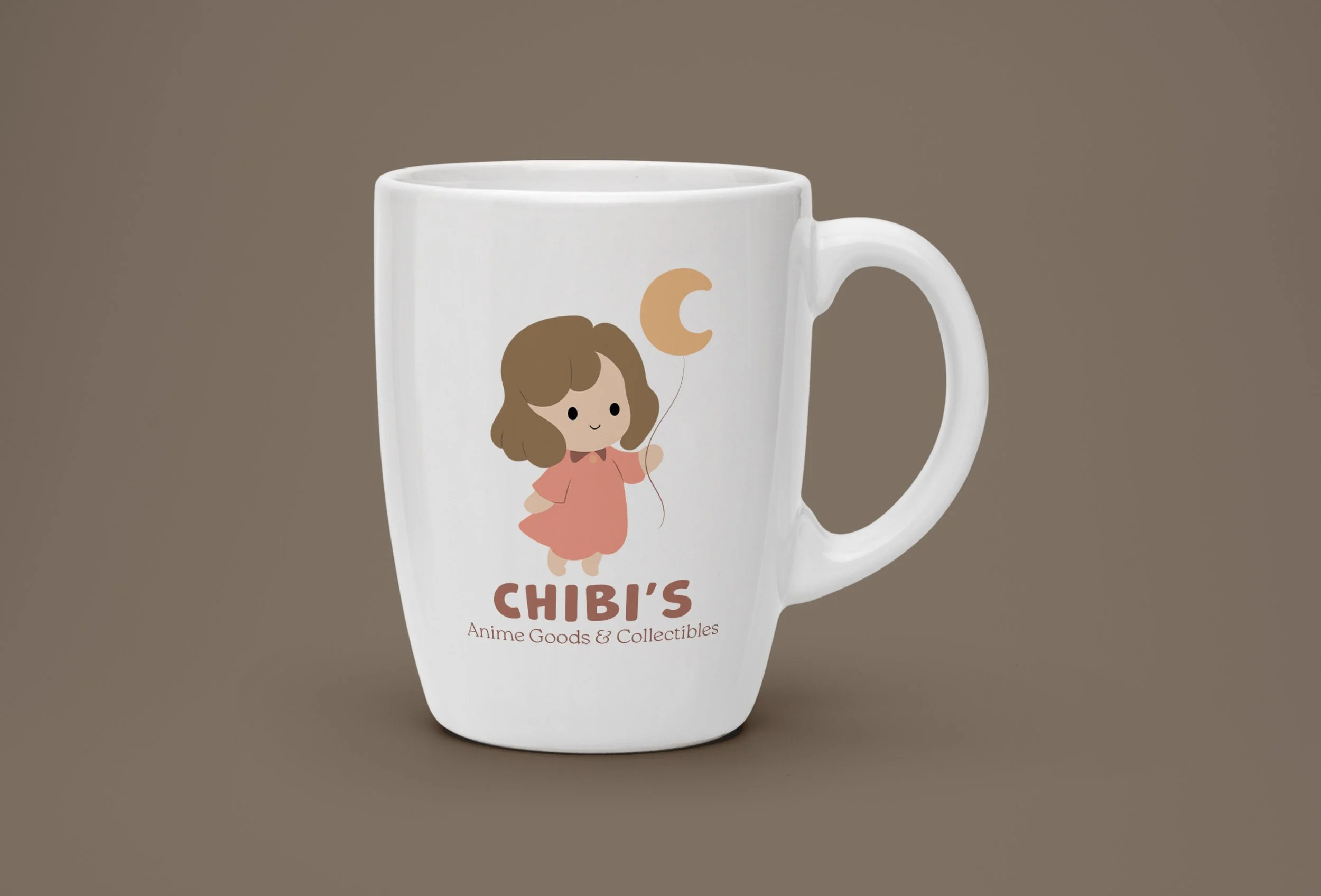
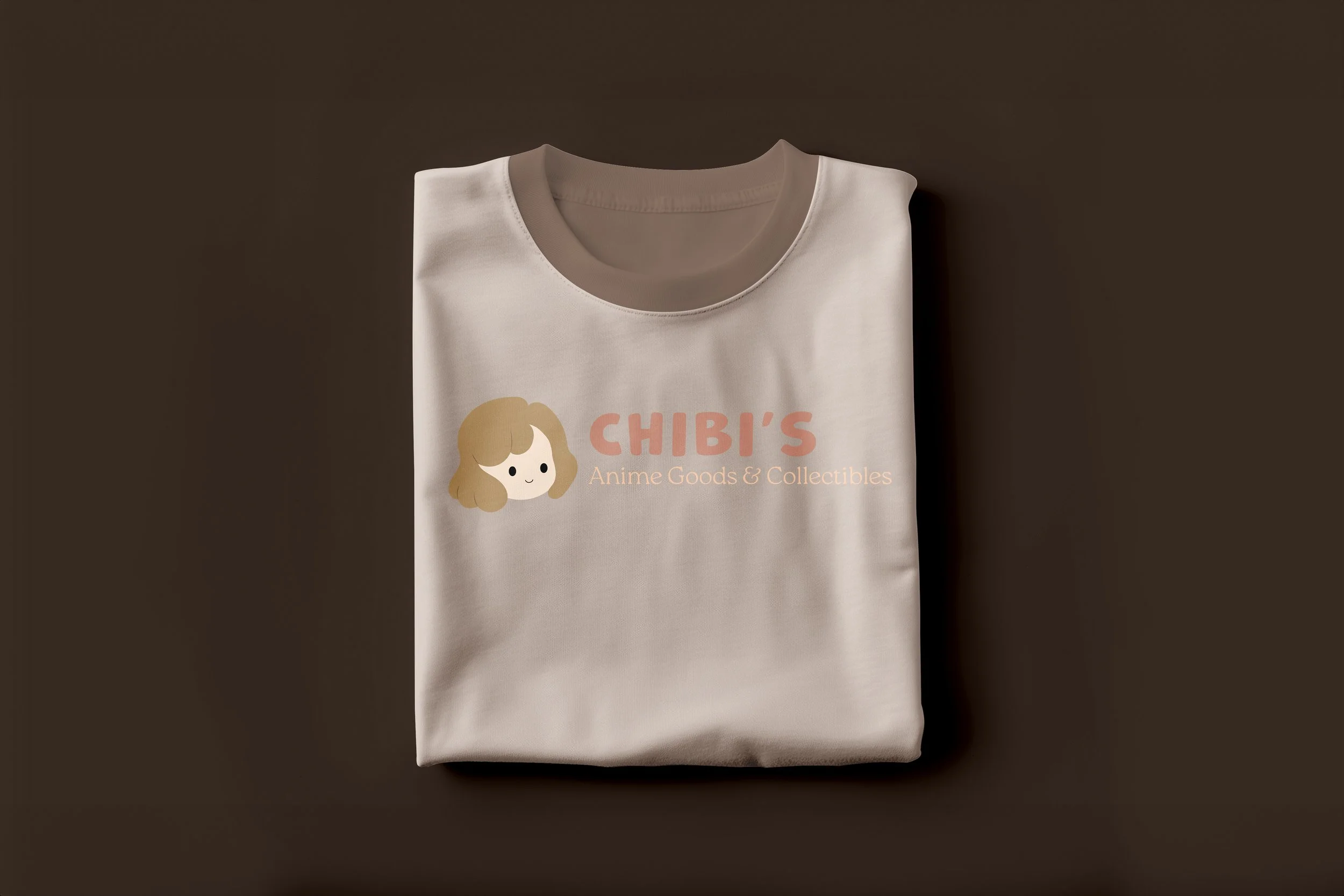
The concept centers around a friendly chibi-style mascot holding a crescent moon balloon—an image that reflects the shop’s soft, whimsical personality and its focus on cute, collectible goods. Rounded typography and a gentle, pastel-inspired colour palette reinforce the brand’s approachable nature, appealing to both long-time anime fans and younger audiences.
This rebrand explores how a refreshed visual system—logo, colours, typefaces, and character design—can create a consistent, emotionally engaging experience across signage, merchandise, packaging, and digital platforms. As a school project, the goal was to develop a visual identity that feels playful, welcoming, and rooted in the charm that makes small, family-run anime shops so special.
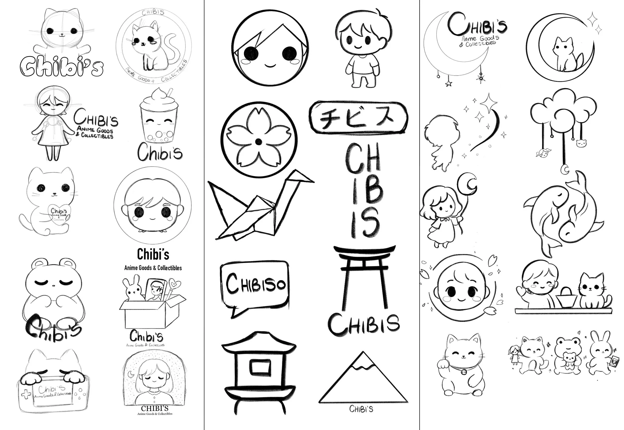
Before
After
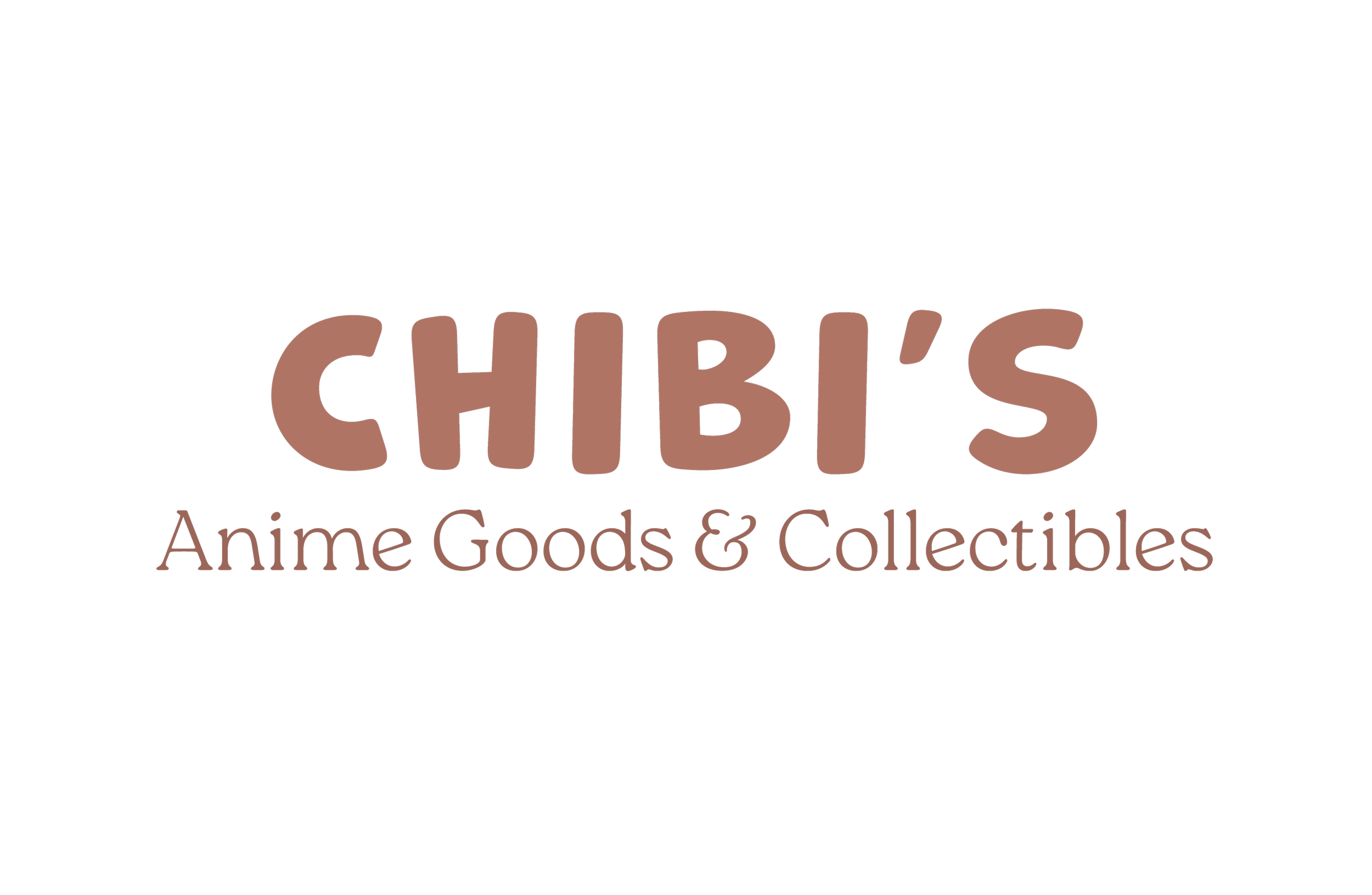
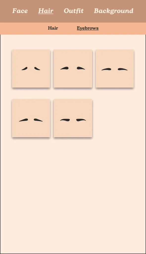
Logo


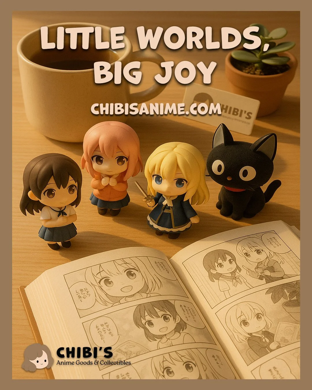
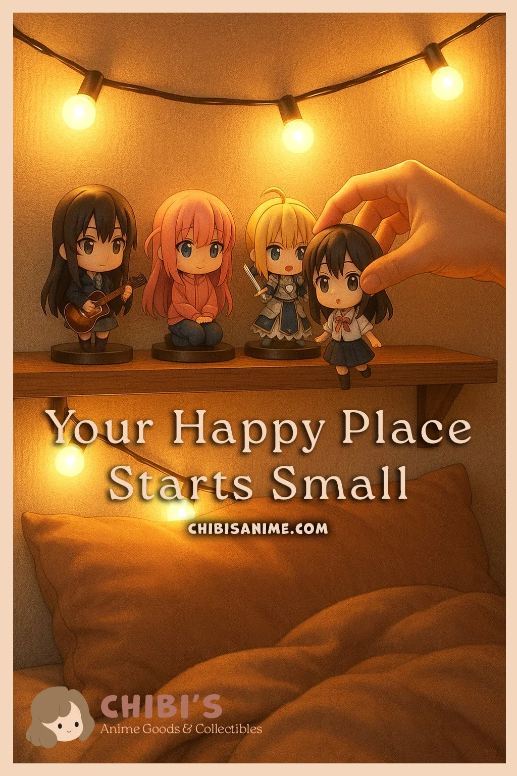
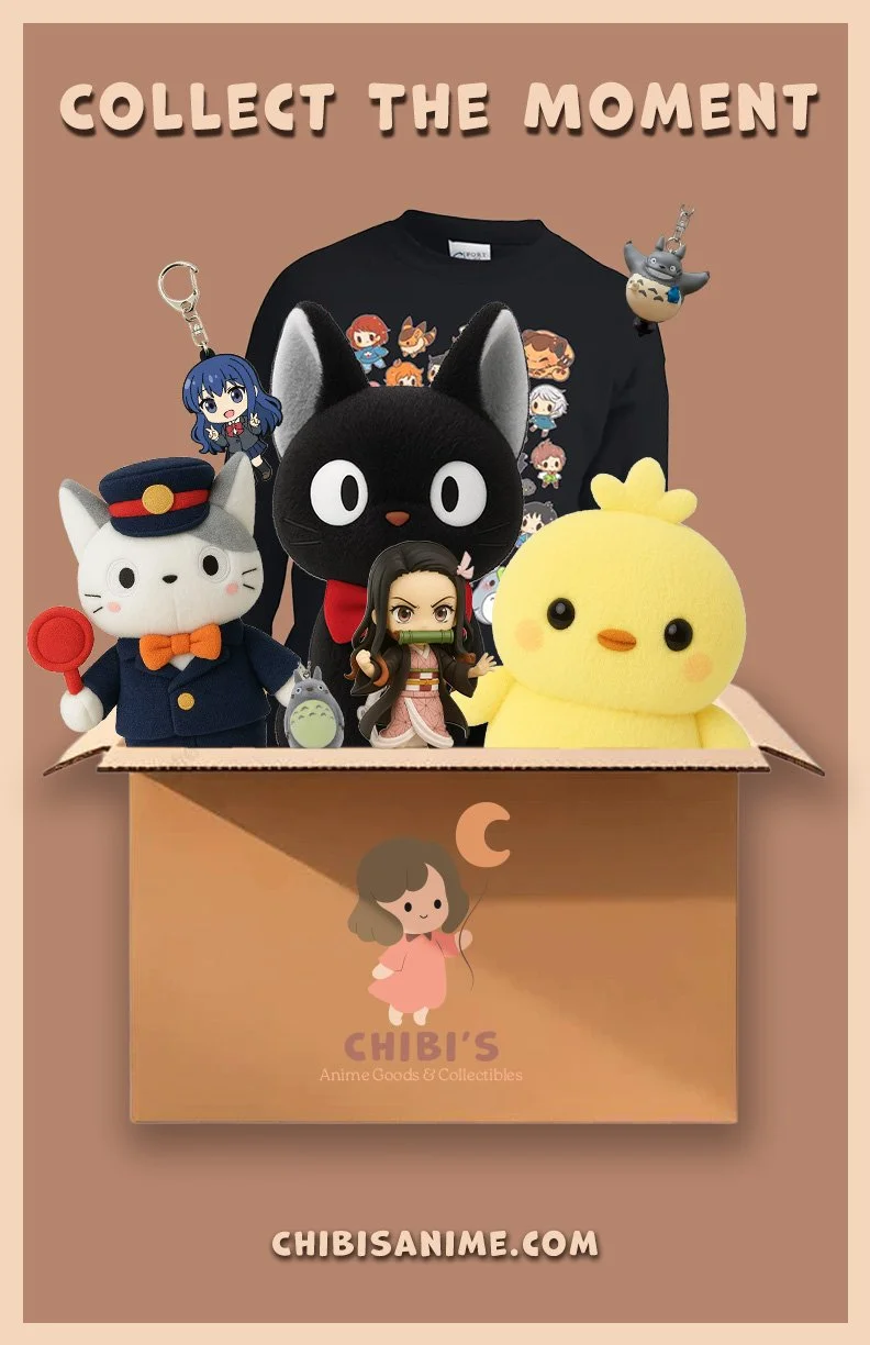
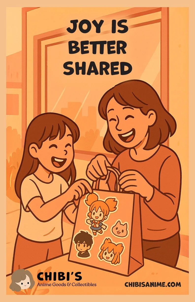
Advertisments
Video Ad
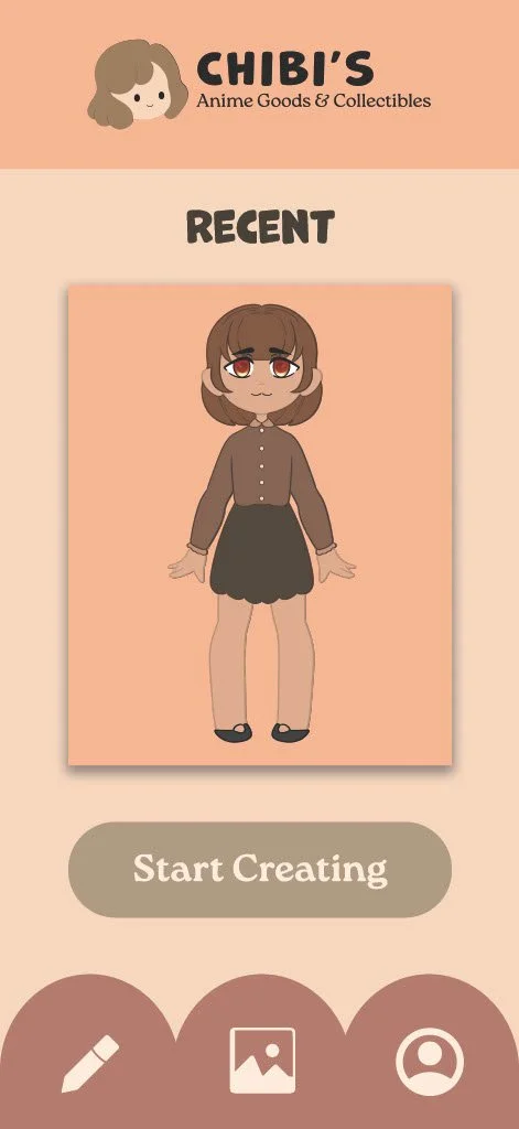
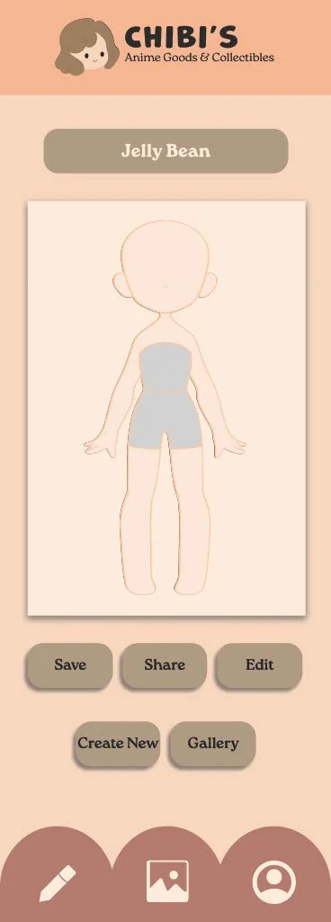
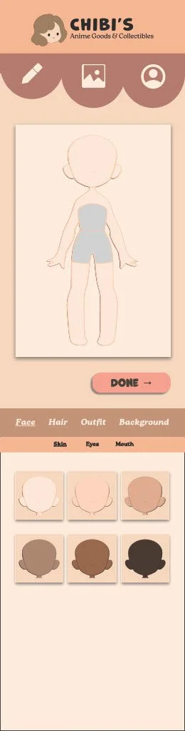
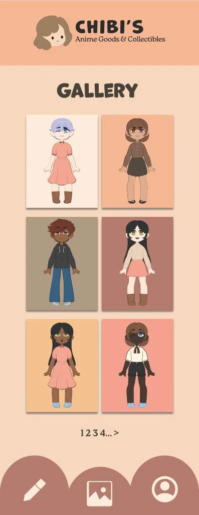
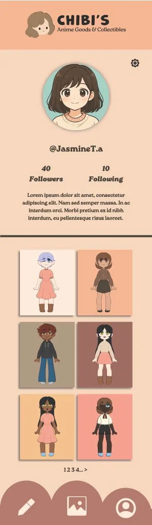
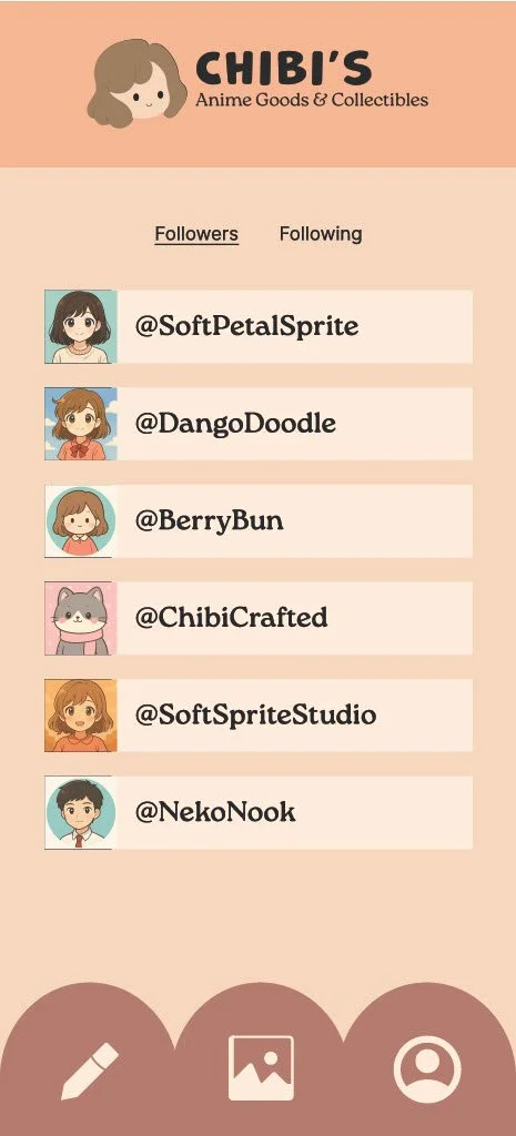
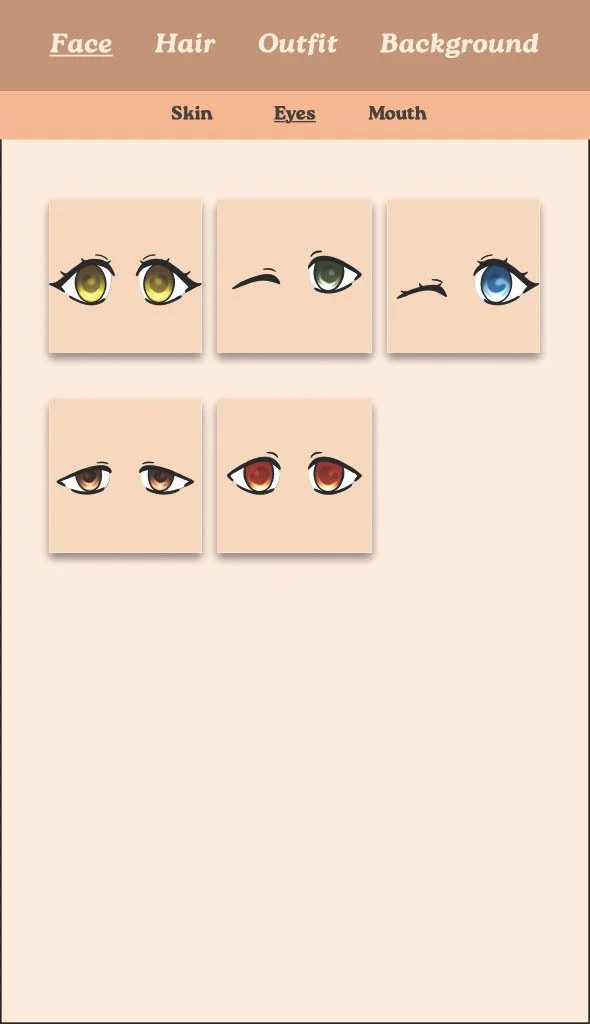
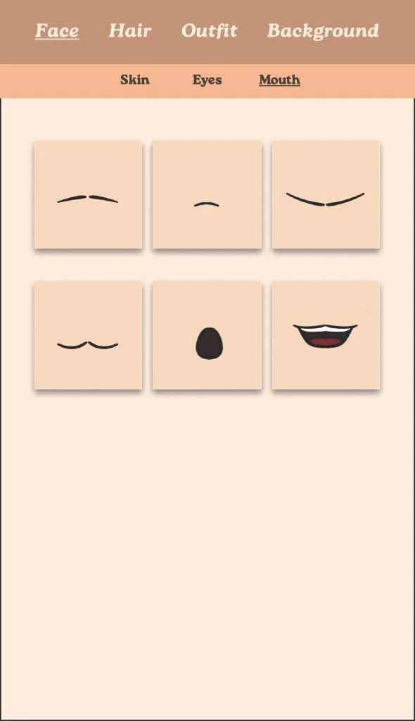
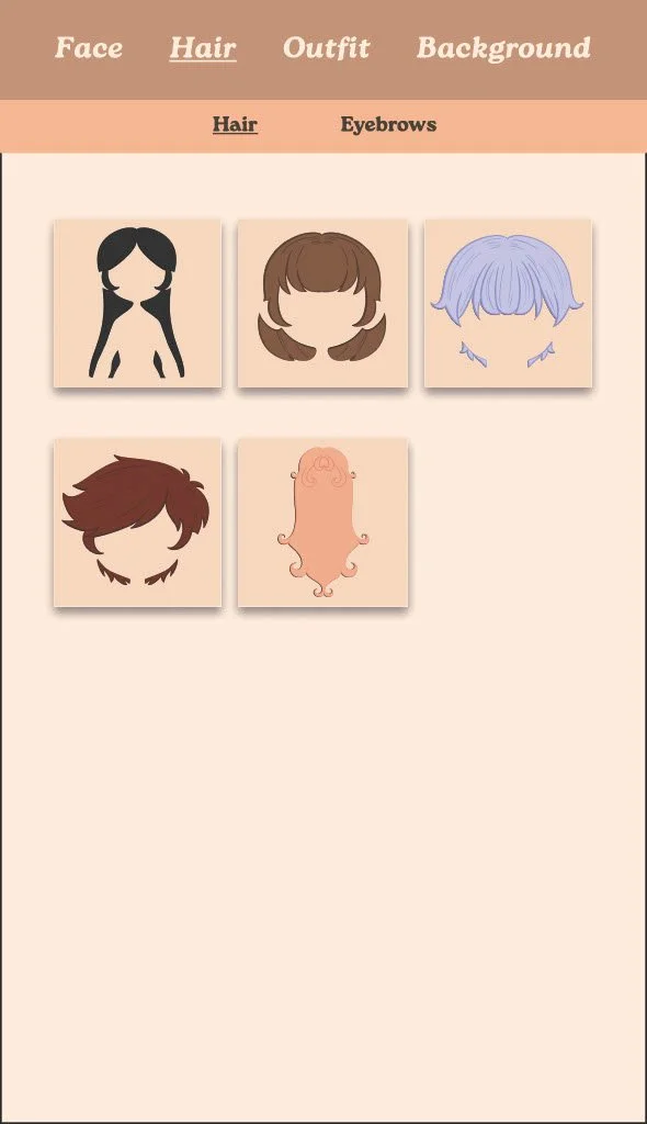
App Comp
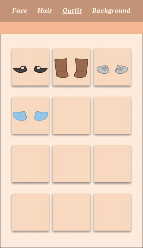
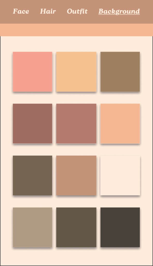
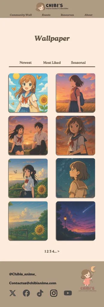
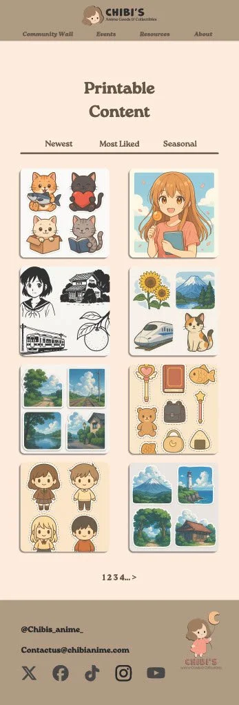
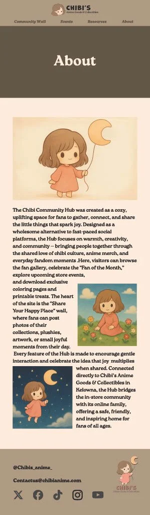
Website
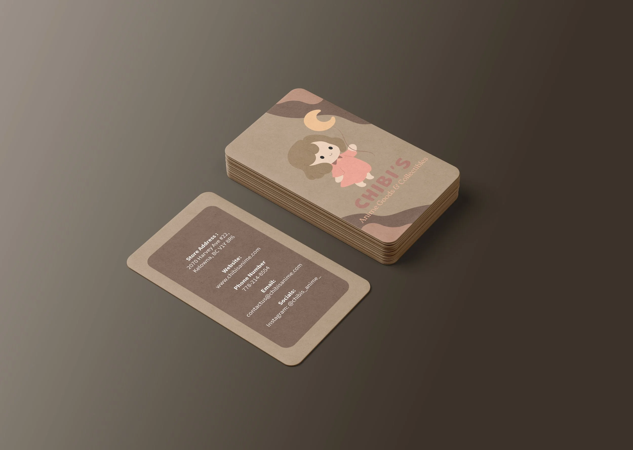
Stationary
Materials used:
Procreate
Illustrator
Photoshop
ChatGPT Images(for ads)
Learning Objectives & Skills Demonstrated:
☾ Developing a Cohesive Brand Identity
☼ This project strengthened the ability to build a unified visual identity by combining logo design, typography, colour, and illustration into one consistent brand system.
☾ Designing a Character-Based Mascot for Branding
☼ Creating a chibi-style mascot required translating personality and brand values into a simple, expressive character design that appeals to a wide audience and aligns with Japanese pop-culture aesthetics.
☾ Applying Soft, Emotionally-Driven Colour Theory
☼ A gentle, pastel-inspired palette was selected to reinforce warmth, friendliness, and approachability. Colour choices were tested across logo usage, packaging, and promotional material for visual consistency.
☾ Establishing Typographic Hierarchy & Brand Voice
☼ Pairing rounded, playful typefaces with clean supporting text helped define a tone that is sweet, welcoming, and readable across digital and print applications.
☾ Creating Market-Appropriate Visual Language
☼ The project developed skills in tailoring design choices to a target audience—balancing kawaii charm with professional clarity suited to an anime goods and collectibles shop.
☾ Concept Development for Hypothetical Client Work
☼ As a student project, it required interpreting an existing business, identifying what the original branding lacked, and designing a refreshed identity that feels authentic, charming, and functional..
Challenges & Solutions
☾ Creating a Mascot That Represents the Brand Without Feeling Childish
✶ The brand aims to be sweet and welcoming, but not aimed exclusively at children. A chibi mascot can easily lean too juvenile if not balanced carefully.
☼ The character design was refined using simplified forms, controlled proportions, and a calm colour palette. These choices kept the mascot adorable and approachable while still fitting an all-ages anime collectibles brand.
☾ Balancing Kawaii Aesthetics With Professional Branding
✶ Cute, soft visuals can risk appearing informal or inconsistent if not grounded in strong design rules.
☼ To maintain professionalism, the project used structured typography, a refined colour palette, clean vector lines, and consistent spacing systems. This ensured the brand stayed polished while still embracing its kawaii roots.
☾ Establishing Clear Visual Hierarchy in Logo & Typography
✶ Combining a mascot illustration with text can create clutter if hierarchy isn’t carefully controlled.
☼ The logo was built with weight contrast, strategic sizing, and careful spacing to ensure the shop name remains prominent while the mascot supports the identity rather than overwhelming it.
☾ Ensuring the Brand Works Across Multiple Applications
✶ A cute mascot and pastel palette must still translate well to signage, packaging, merchandise, and digital platforms.
☼ The design was tested in various mockups: print, website, and product concepts, to ensure colour consistency, readability, and scalability in all formats.