Two-point Perspective Practice
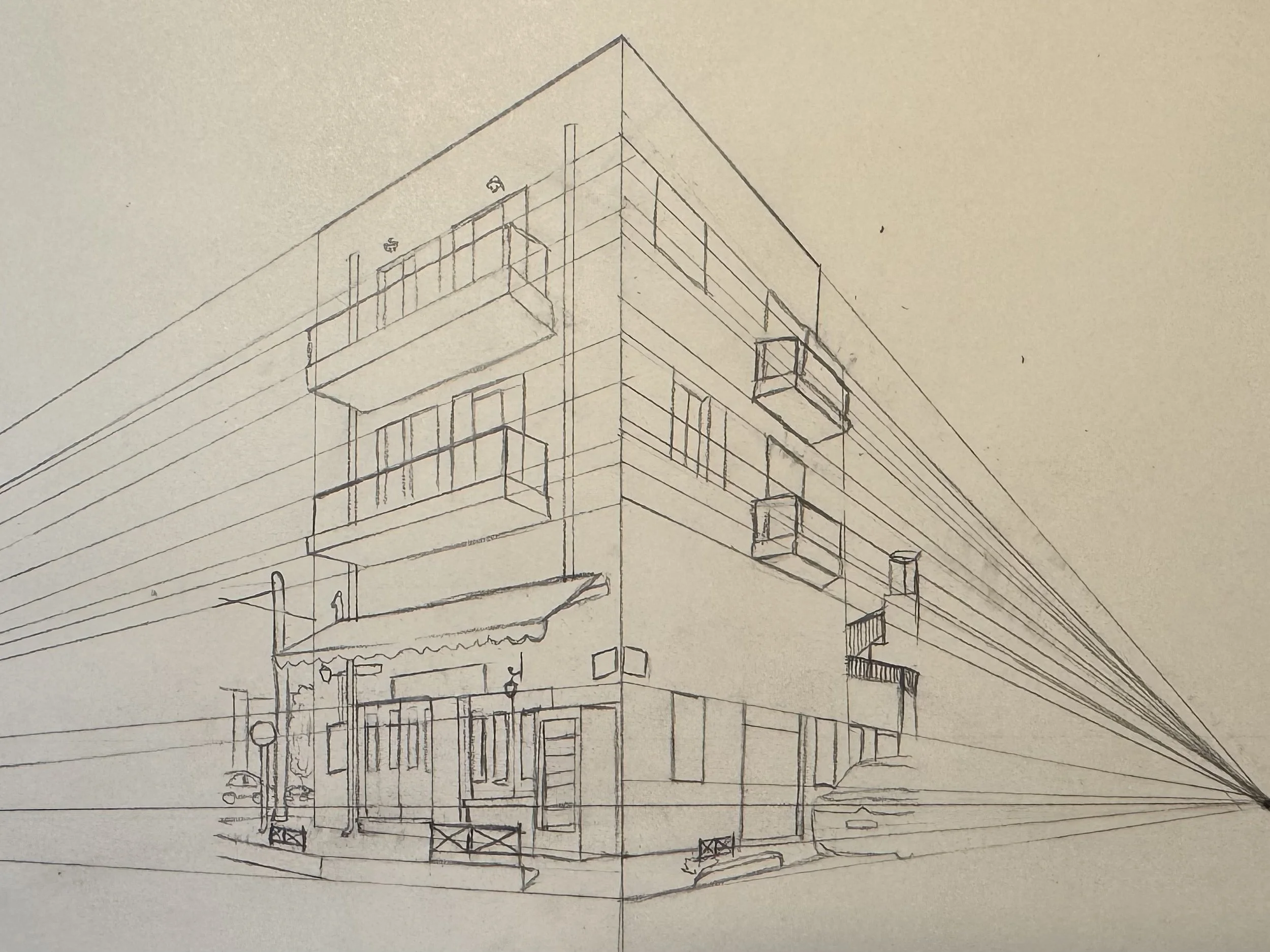
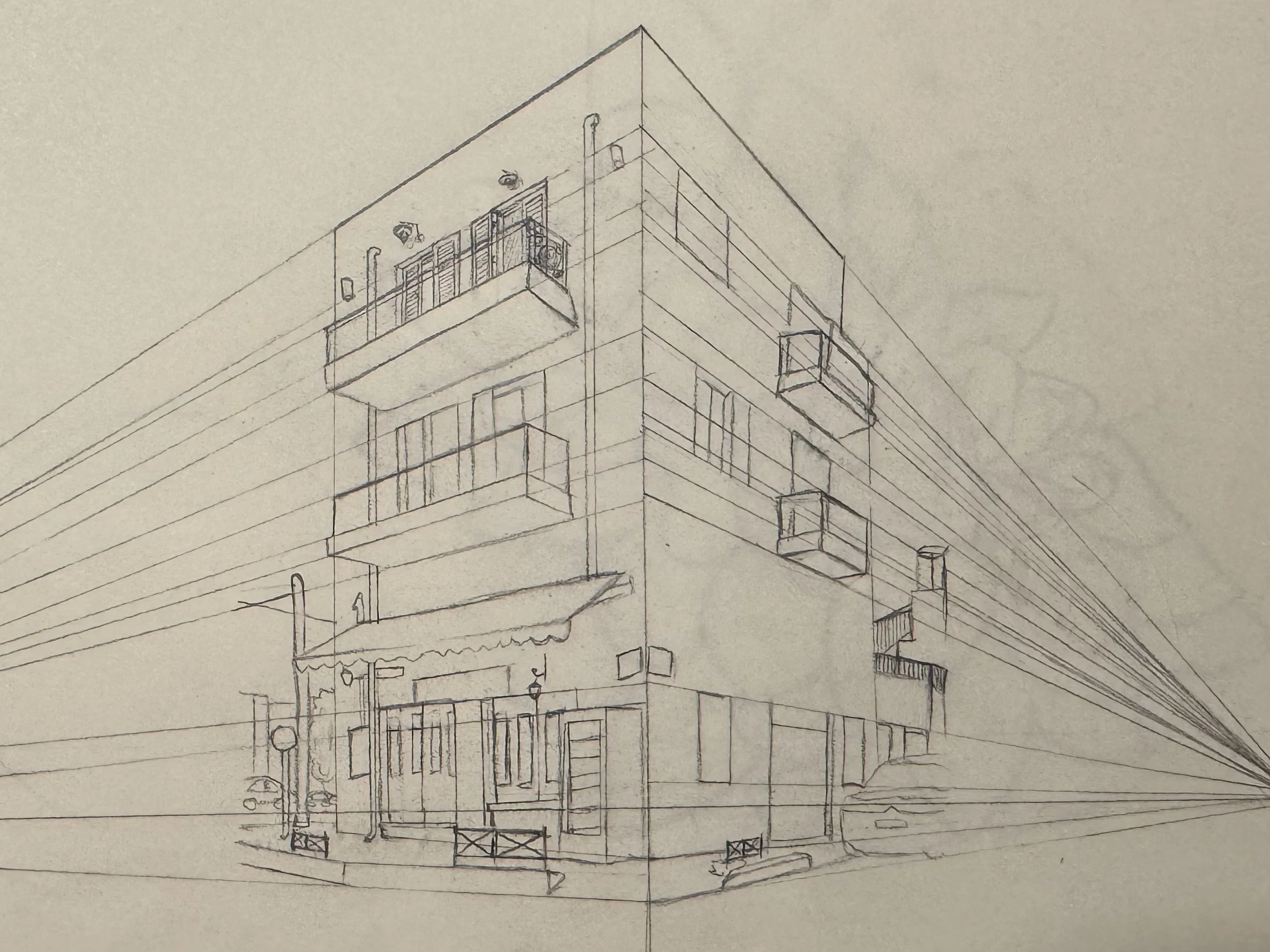
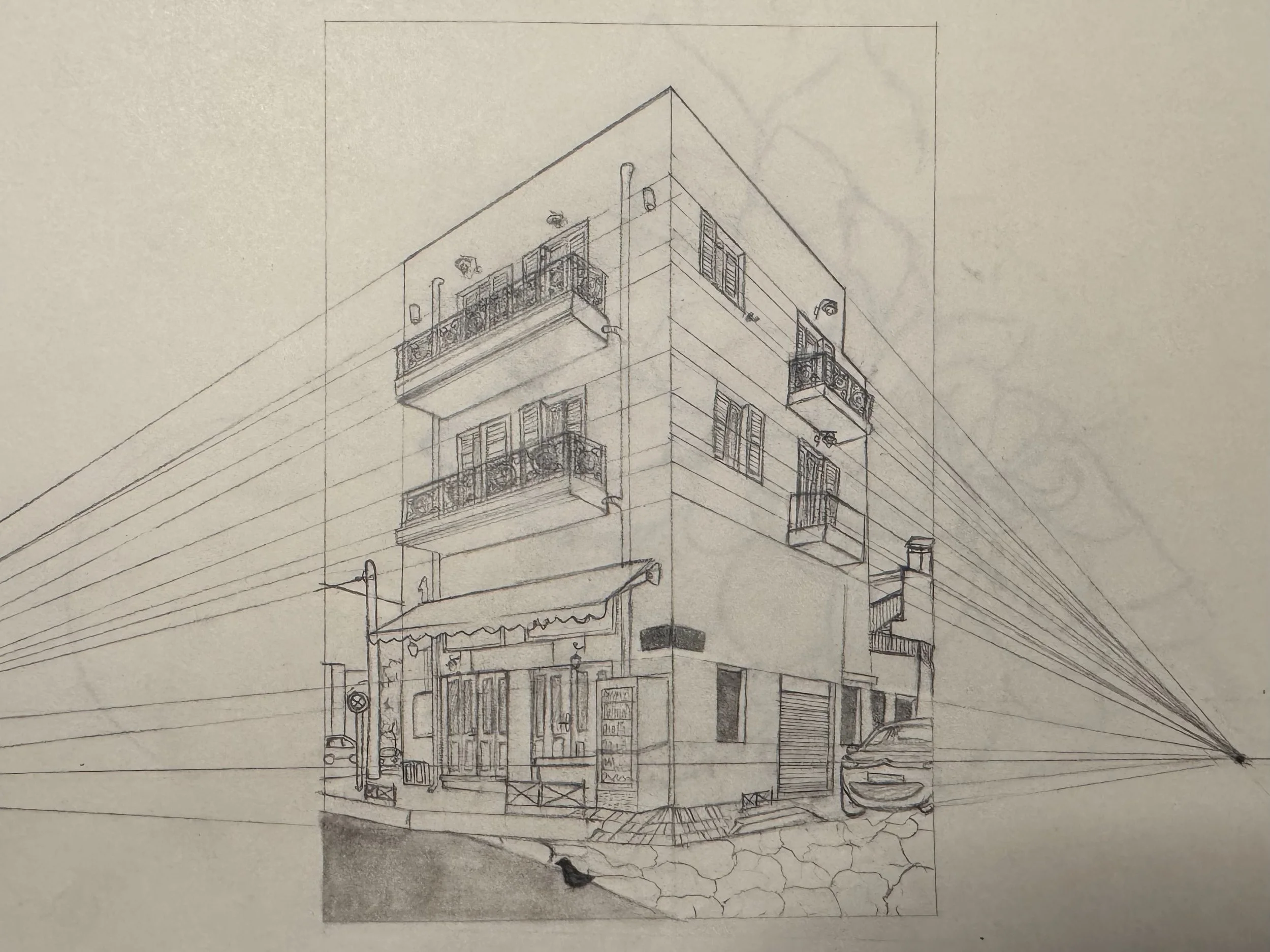
This project is a traditional pencil drawing created to demonstrate accurate two-point perspective using an existing building as the architectural subject. The goal of the piece was to show structure, depth, and realism through precise perspective guidelines and detailed linework. The drawing began with foundational construction lines to establish the vanishing points and overall proportions. From there, I focused on refining the building’s balconies, windows, storefront details, and surrounding environment to create a convincing sense of scale and space. The shading was added gradually to emphasize form, lighting, and material texture while maintaining clarity in the perspective layout.
The chosen building offered strong geometric forms and clear angles, making it ideal for perspective practice. The ornate balcony railings and storefront details provided additional complexity in proportion and alignment. Certain minor details were simplified to maintain clarity within the perspective grid.
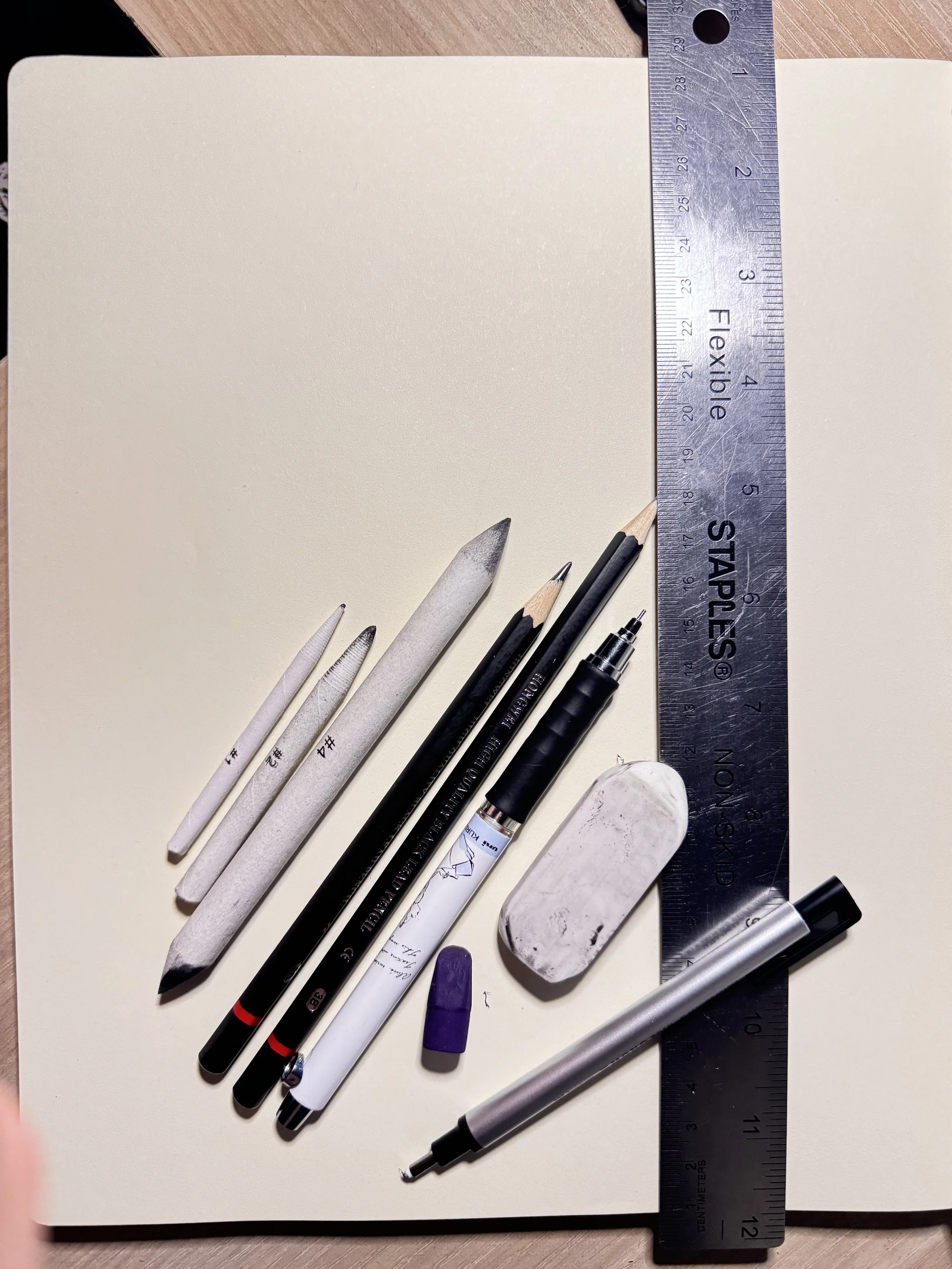
Materials used:
Pencils
☾ 0.05 Mechanical Pencil
☾ 2H Pencil
☾ 3B Pencil
Blend Sticks
☾ #1
☾ #2
☾ #4
Other
☾ 12IN Ruler
☾ Erasers
Learning Objectives & Skills Demonstrated:
☾ Accurate two-point perspective construction
☾ Understanding of vanishing points and horizon line placement
☾ Architectural proportion and spatial depth
☾ Line weight control for visual hierarchy
☾ Shading technique for realism and form
☾ Observational drawing from real-world architecture
Challenges & Solutions
☾ Aligning multiple vanishing point lines
✶ Managing two separate vanishing points while keeping all architectural elements aligned can easily cause distortion.
☼ To solve this, I established the horizon line early and extended long, consistent guidelines to each vanishing point. I frequently cross-checked every major edge, window, balcony, and roofline against the correct vanishing point to prevent drift. Using a ruler for long structural lines ensured accuracy and allowed me to correct perspective shifts before continuing.
☾ Maintaining accuracy while adding surface details
✶ Small details like railings, windows, signs, and storefront elements can warp the perspective if placed incorrectly.
☼ Before committing to more information, I lightly mapped the proportional boundaries within the perspective grid. This kept everything anchored to the building’s underlying structure. I added details from general to specific—first blocking shapes, then refining them only after confirming alignment with the perspective lines. This layered approach allowed me to keep accuracy without overworking the drawing.
☾ Creating balanced shading without flattening perspective
✶ Shading can easily make a drawing look flat if values aren’t distributed with the light source and spatial depth in mind.
☼ I studied the building’s actual lighting direction and assigned value groups accordingly. Planes facing the light were kept lighter, while recessed areas were painted darker. I used controlled blending to soften shadows while keeping edges crisp where needed to maintain structural clarity. Increasing contrast on the closest surfaces and reducing detail as forms receded helped preserve depth and avoid flattening.
☾ Translating curved or ornate details into geometric perspective
✶ Elements like balcony railings and decorative trim contain curves and patterns that become difficult to place accurately in perspective.
☼ I simplified curved or ornate details into basic geometric shapes first; circles into ellipses, curves into angled segments, and patterns into repeated grid-based forms. Once the simplified structure matched the perspective, I layered the actual decorative shapes on top. This method allowed complex details to remain consistent with the building’s geometry without overwhelming the drawing.